Dashboards
Lecture 16
University of Arizona
INFO 526 - Summer 2024
Dashboards
Dashboards
2006:
Visually display most important information on one screen
Monitored by a glance
2020+:
Reactive to user needs & questions
Regularly updating
Produces reports
Several (common) tools


Key performance indicators (KPIs)
Benchmarks
Outcomes
🌮 Increase customer satisfaction
🚹 🚺 Address inequity in salaries
🦕 Grow audience & Patreon subscribers
Key performance indicators (KPIs)
Project measurements
Inputs
🌮 Ingredient costs, labor costs
🚹 🚺 Employee data, salary data
🦕 Viewership/subscribers
Process
🌮 Speedy service, product consistency
🚹 🚺 Contract amounts, raises + promotions
🦕 Speed of production, number of revisions
Outcome
🌮 Good tacos in minimal time
🚹 🚺 Individuals with equal pay
🦕 Interesting and educational videos
Key performance indicators (KPIs)
Lagging KPI:
- Performance indicator of something that has happened

Leading KPI:
- Performance indicator that signals something to come

Dashboards
Named after car dashboards
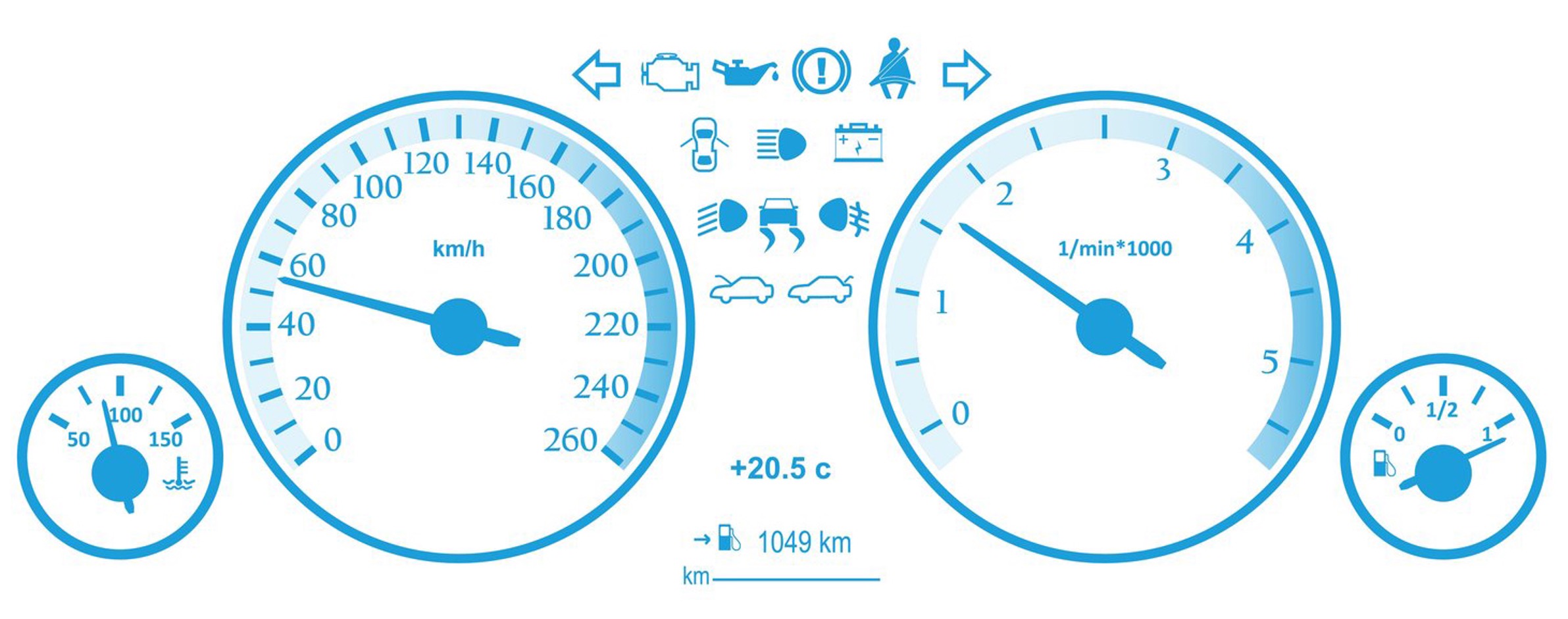
Dashboard visualizations
Gauge plot: They are all what Edward Tufte would call “low data to ink” plots (and which he would hate)
Speedometers = low-information donut plot where only one number means anything about the data.
The other numbers & colors are there to provide context and meaning for that data point.
For all of these, you could cover up the dial and just leave the number and you’d have the same info.
Making gauge plots
Making gauge plots II
Code
fig <- plot_ly(
  domain = list(x = c(0, 1), y = c(0, 1)),
  value = 450,
  title = list(text = "Speed"),
  type = "indicator",
  mode = "gauge+number+delta",
  delta = list(reference = 380),
  gauge = list(
    axis =list(range = list(NULL, 500)),
    steps = list(
      list(range = c(0, 250), color = "lightgray"),
      list(range = c(250, 400), color = "gray")),
    threshold = list(
      line = list(color = "red", width = 4),
      thickness = 0.75,
      value = 490)))
fig <- fig %>%
  layout(margin = list(l=20,r=30))

fig
Bullet charts
Similar to battery charts:
Essentially stacked bar plot
Gray/“uncharged” group
Colored/“charged” proportion group
Adds to 100
Value boxes

Shows key information
Digestible
Uses Icons
Icons
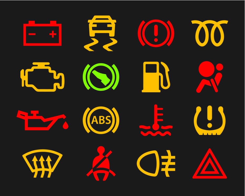
Common car warning lights
Do all make sense without a label?
With dashboards you can have hover-over labels or include text, but only while that icon still likely retains meaning
Icons lose & gain meaning much faster than you would expect

Started being used for romantic love in the 1400’s
Quarto dashboards
Similar structure to what we’ve been using!
Simpler / more straightforward than Shiny
Aesthetically pleasing
Dashboard layout
Navigation

Layout
Orientation
Scrolling
Pages
Tabsets
Tabsets
Cards
Created automatically for cells & markdown content that are within rows/columns:
Can also just contain markdown via .card
More
The above and more can be found here!
