# load packages
library(countdown)
library(tidyverse)
library(mapproj)
library(sf)
library(geofacet)
library(glue)

# set theme for ggplot2
ggplot2::theme_set(ggplot2::theme_minimal(base_size = 14))

# set width of code output
options(width = 65)

# set figure parameters for knitr
knitr::opts_chunk$set(
  fig.width = 7,        # 7" width
  fig.asp = 0.618,      # the golden ratio
  fig.retina = 3,       # dpi multiplier for displaying HTML output on retina
  fig.align = "center", # center align figures
  dpi = 300             # higher dpi, sharper image
)Visualizing geospatial data I
Lecture 13
John Snow and 1854 cholera epidemic

10% of the population of Soho died in a week (!!)
Miasma theory said it was because the air was bad


The Broad Street pump

Outright lies
Outright lies

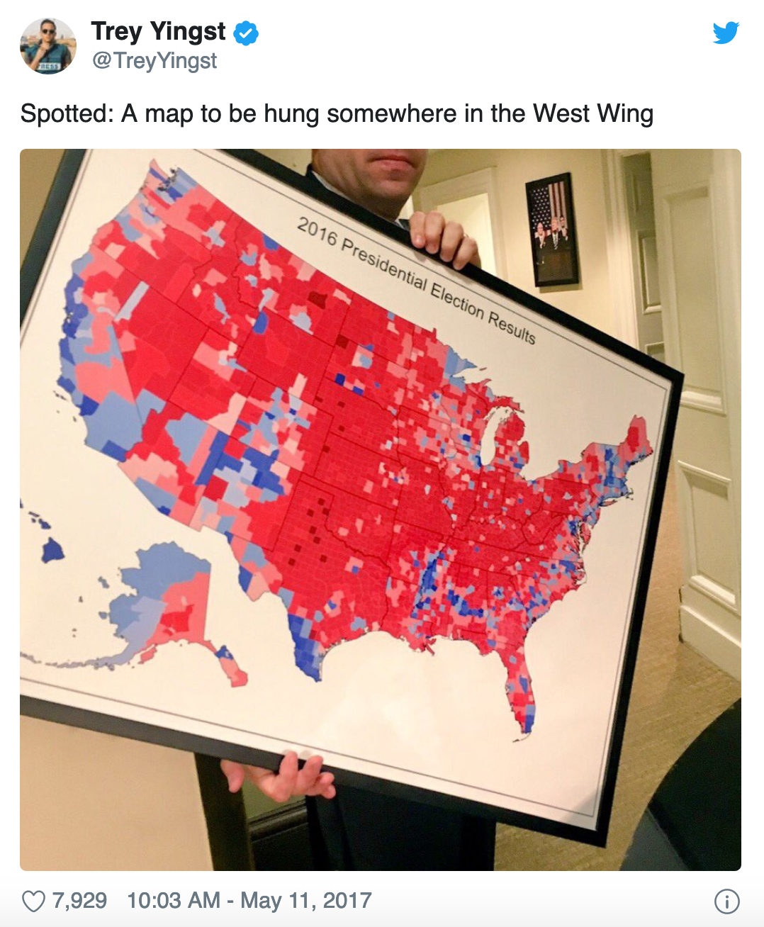
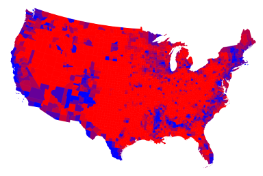
Fake maps and junk maps
Fake maps and junk maps
Chloropleths can be great
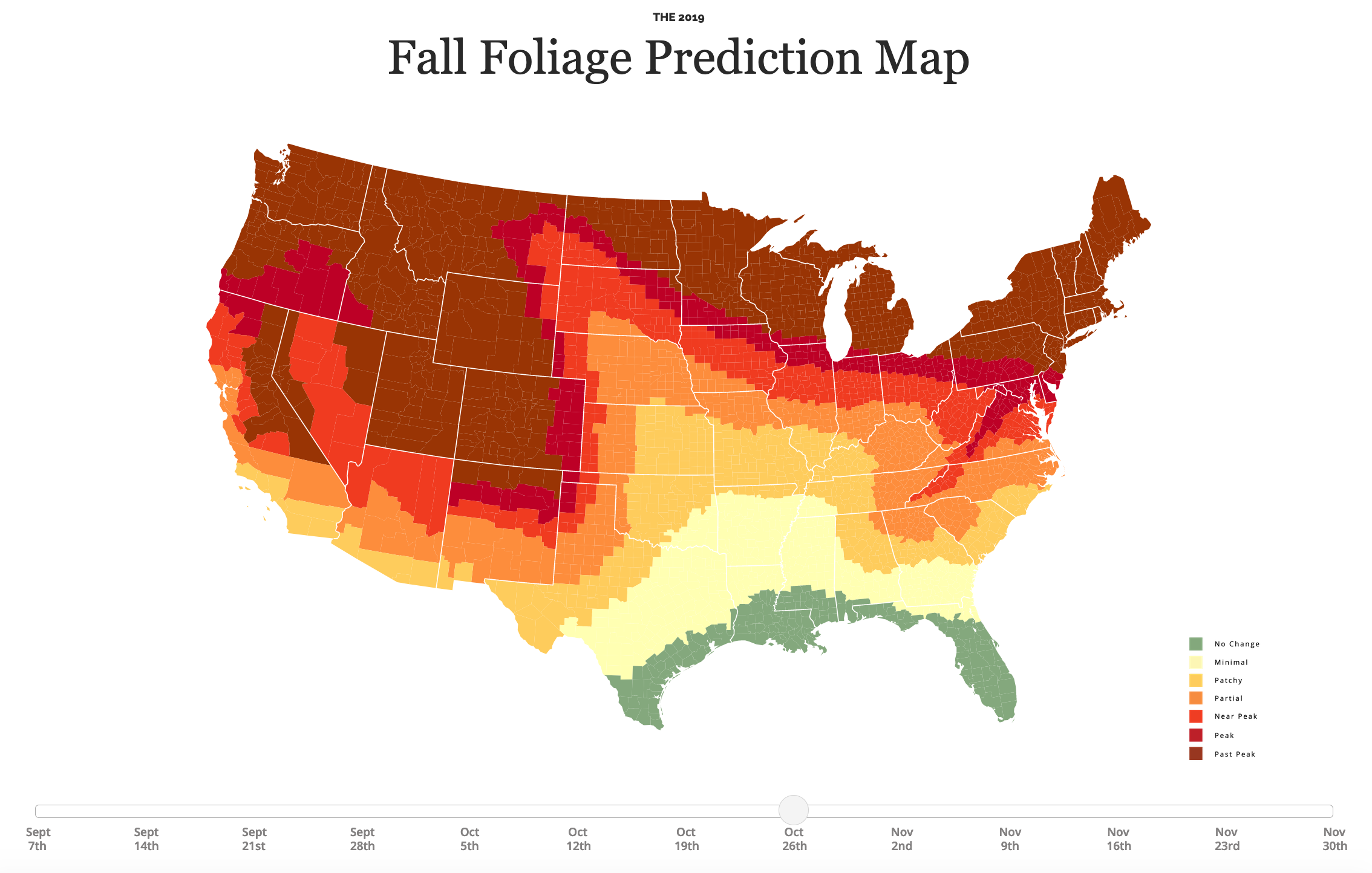
Chloropleths can distort
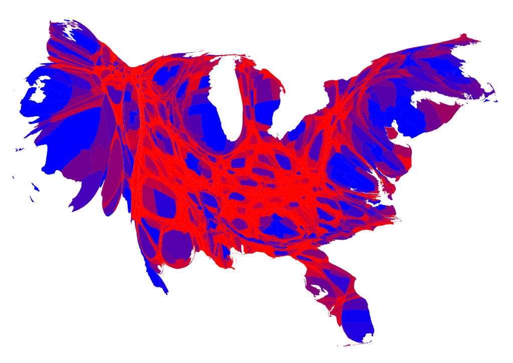
Cartograms

Visualizing geographic areas
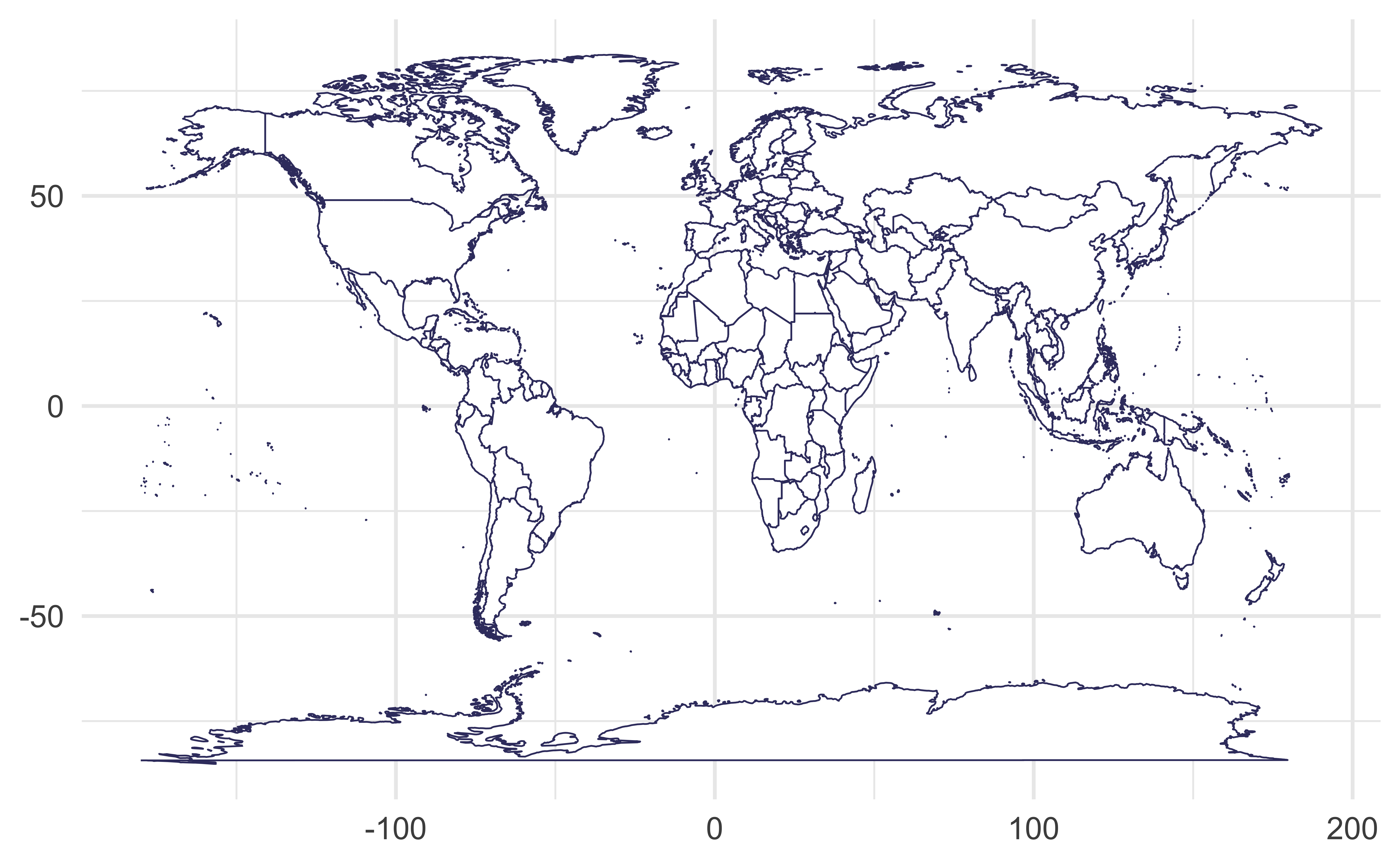
Without any projection, on the cartesian coordinate system
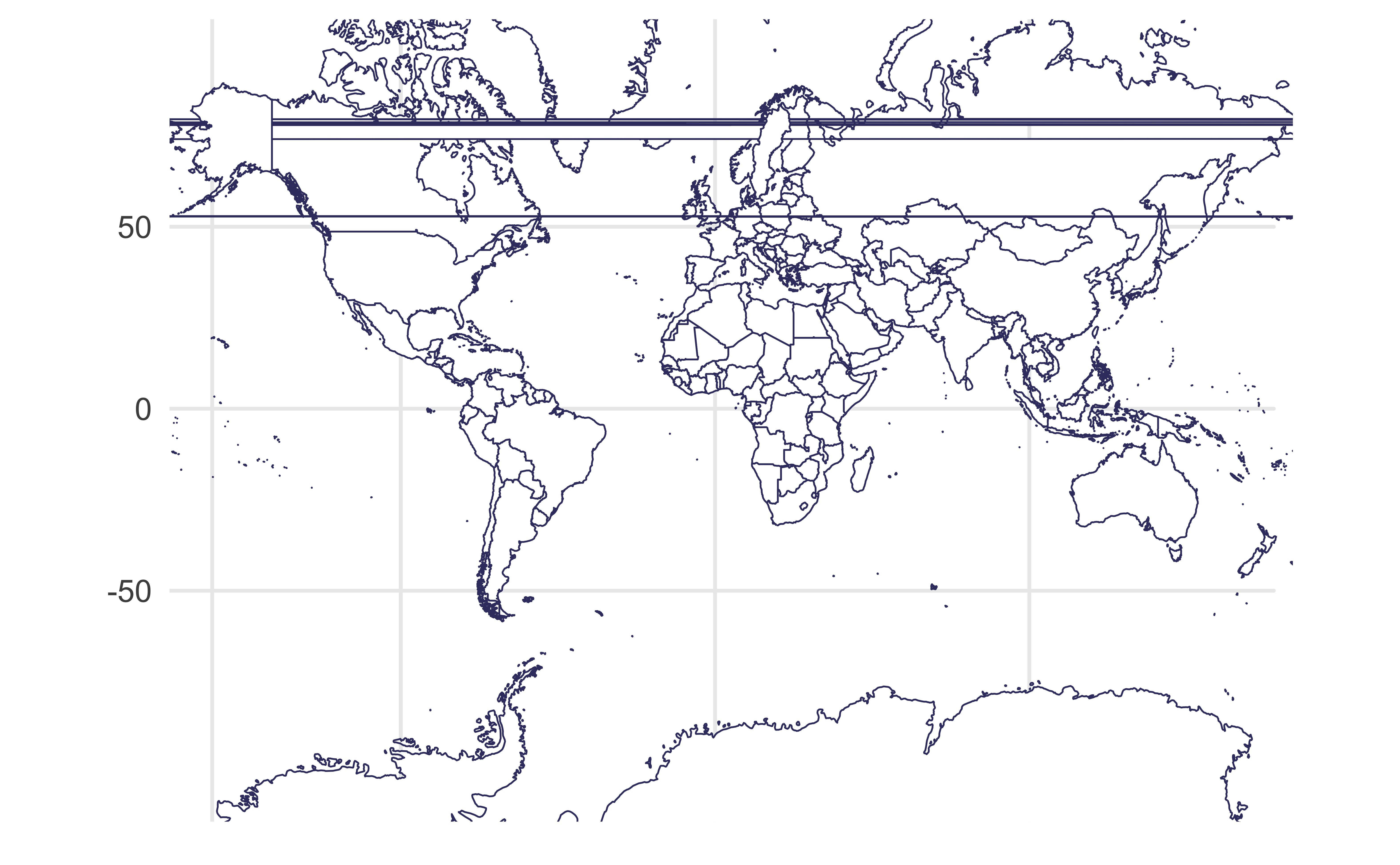
Mercator projection
Meridians are equally spaced and vertical, parallels are horizontal lines whose spacing increases the further we move away from the equator
Mercator projection
without the weird straight lines through the earth!
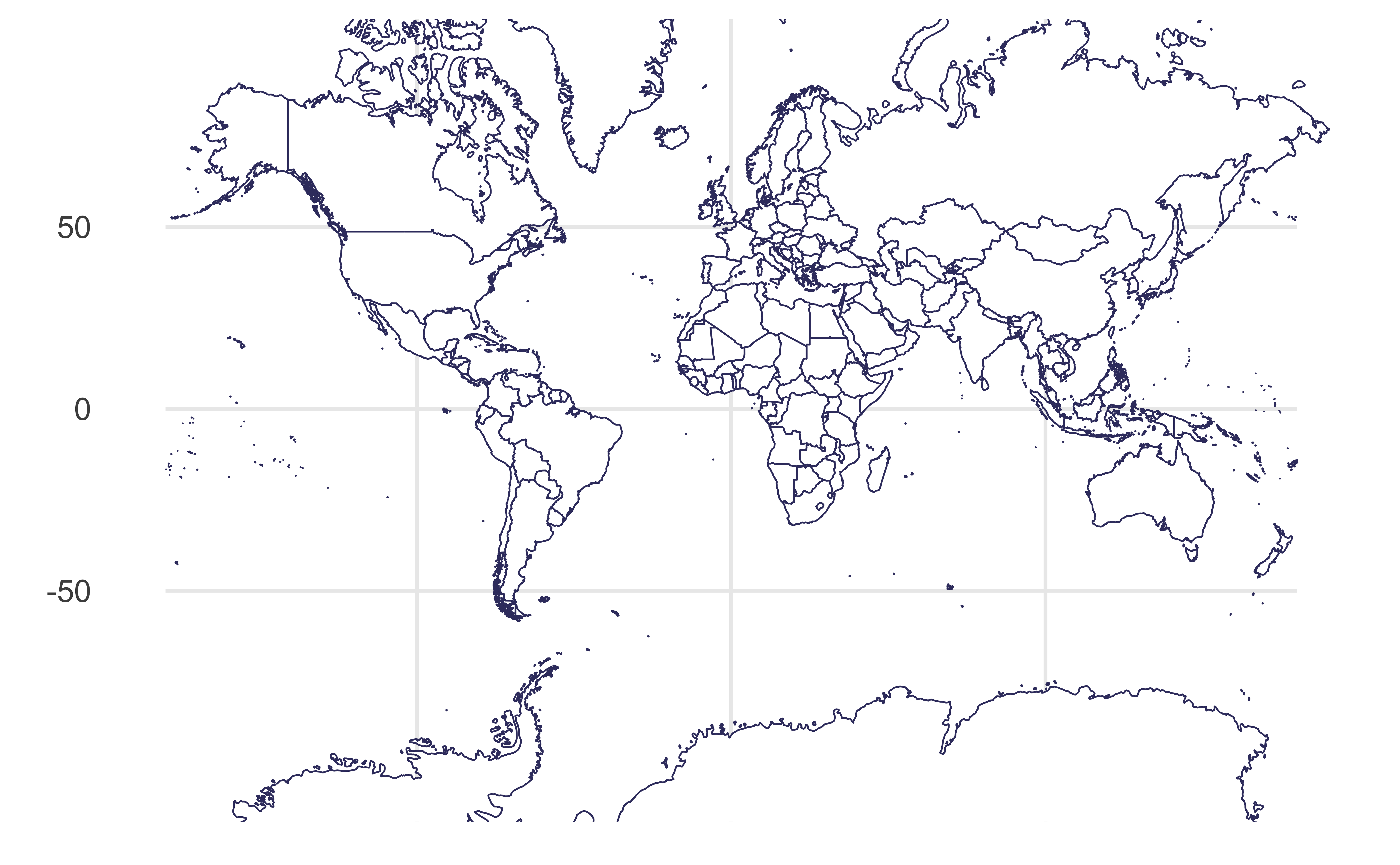
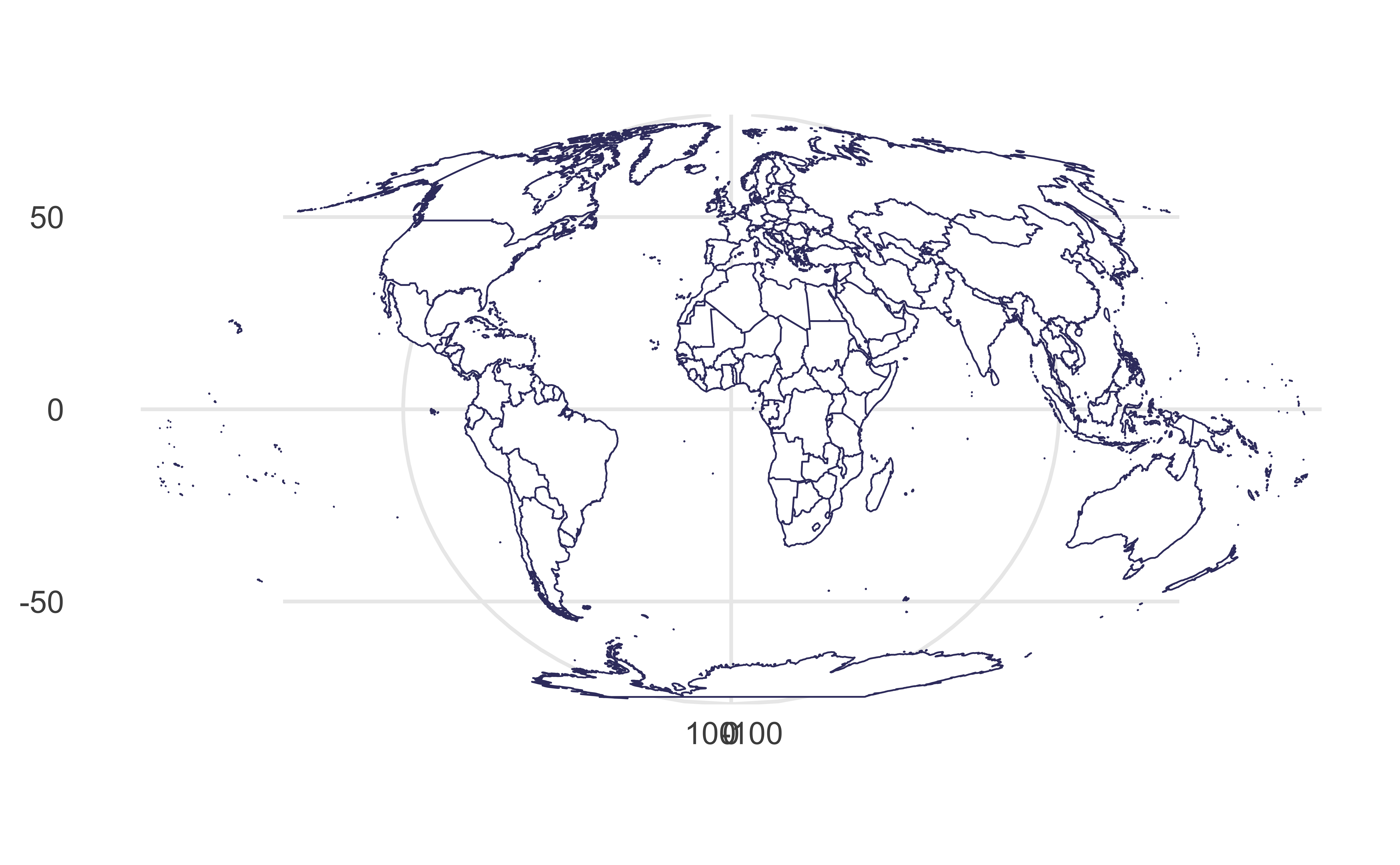
Sinusoidal projection
Parallels are equally spaced
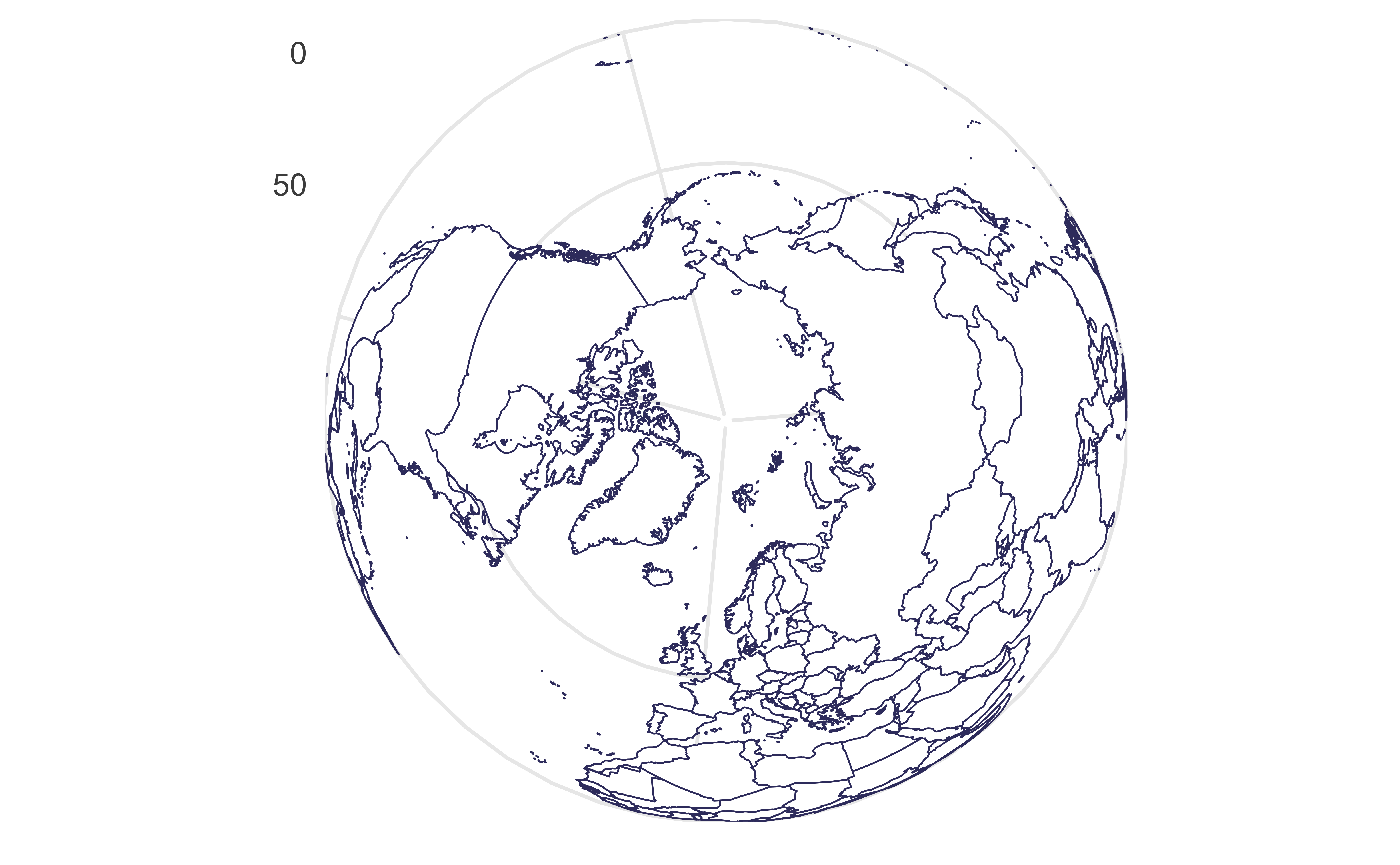
Orthographic projection
Viewed from infinity
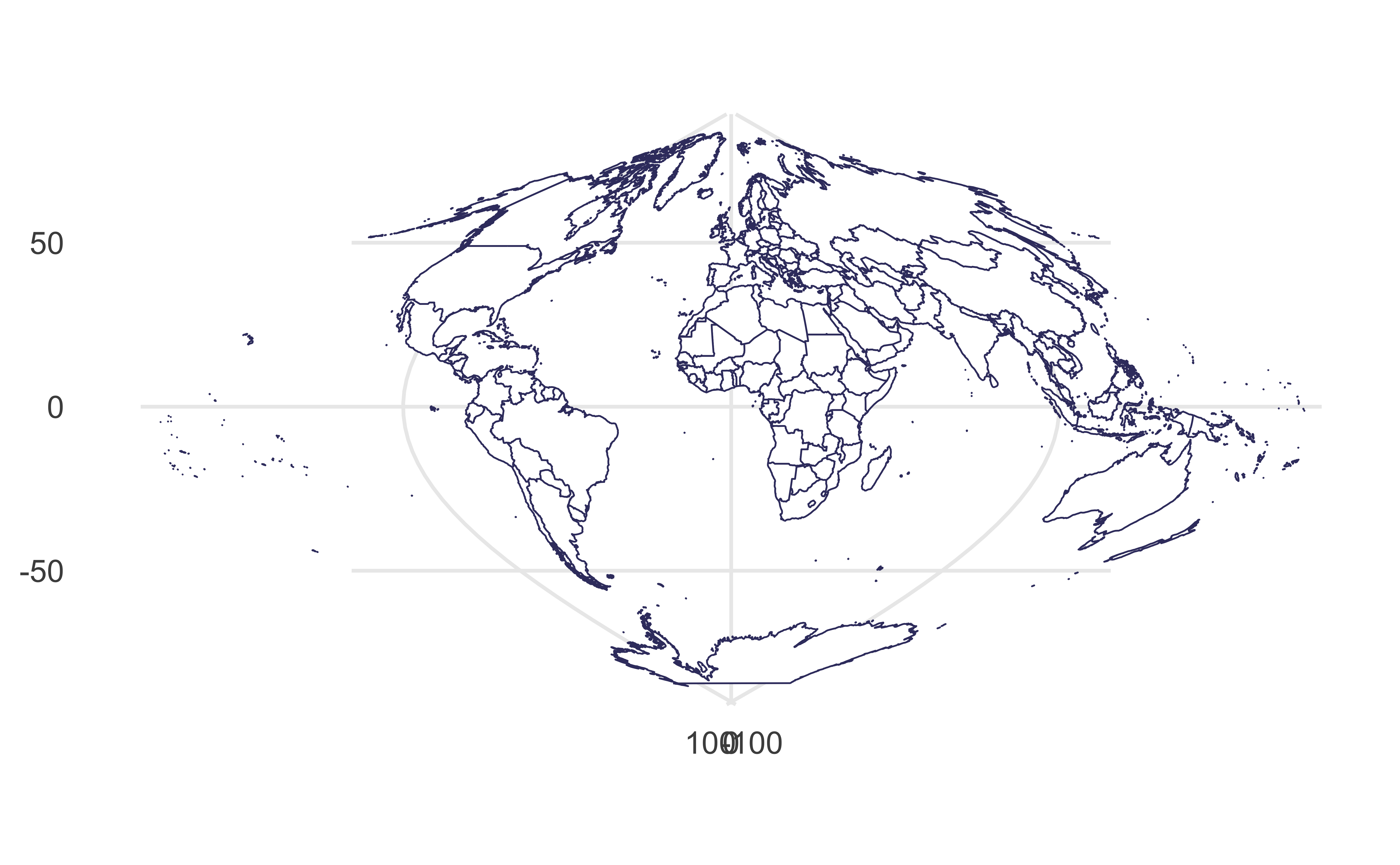
Mollweide projection
Equal-area, hemisphere is a circle
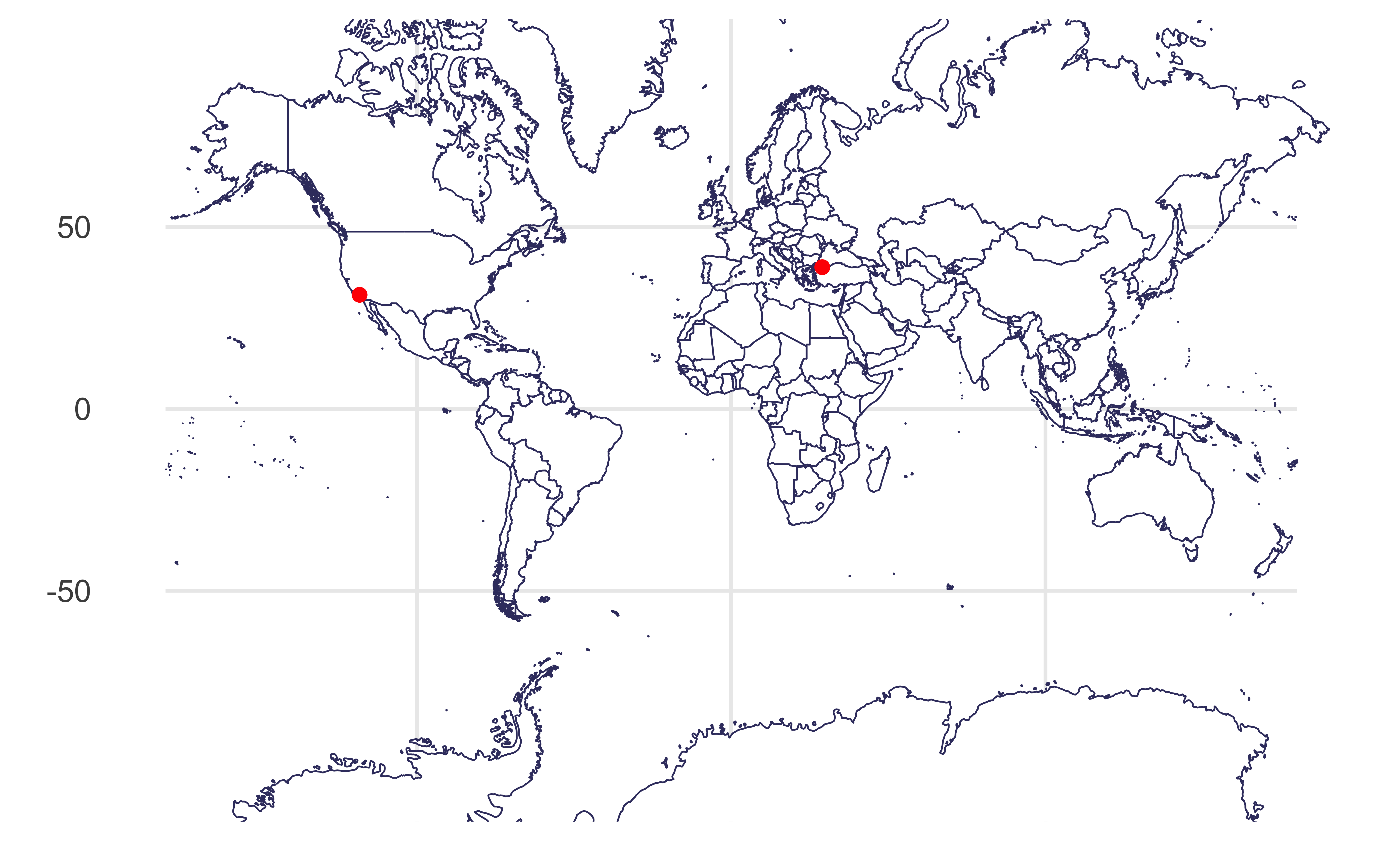
Visualizing distances
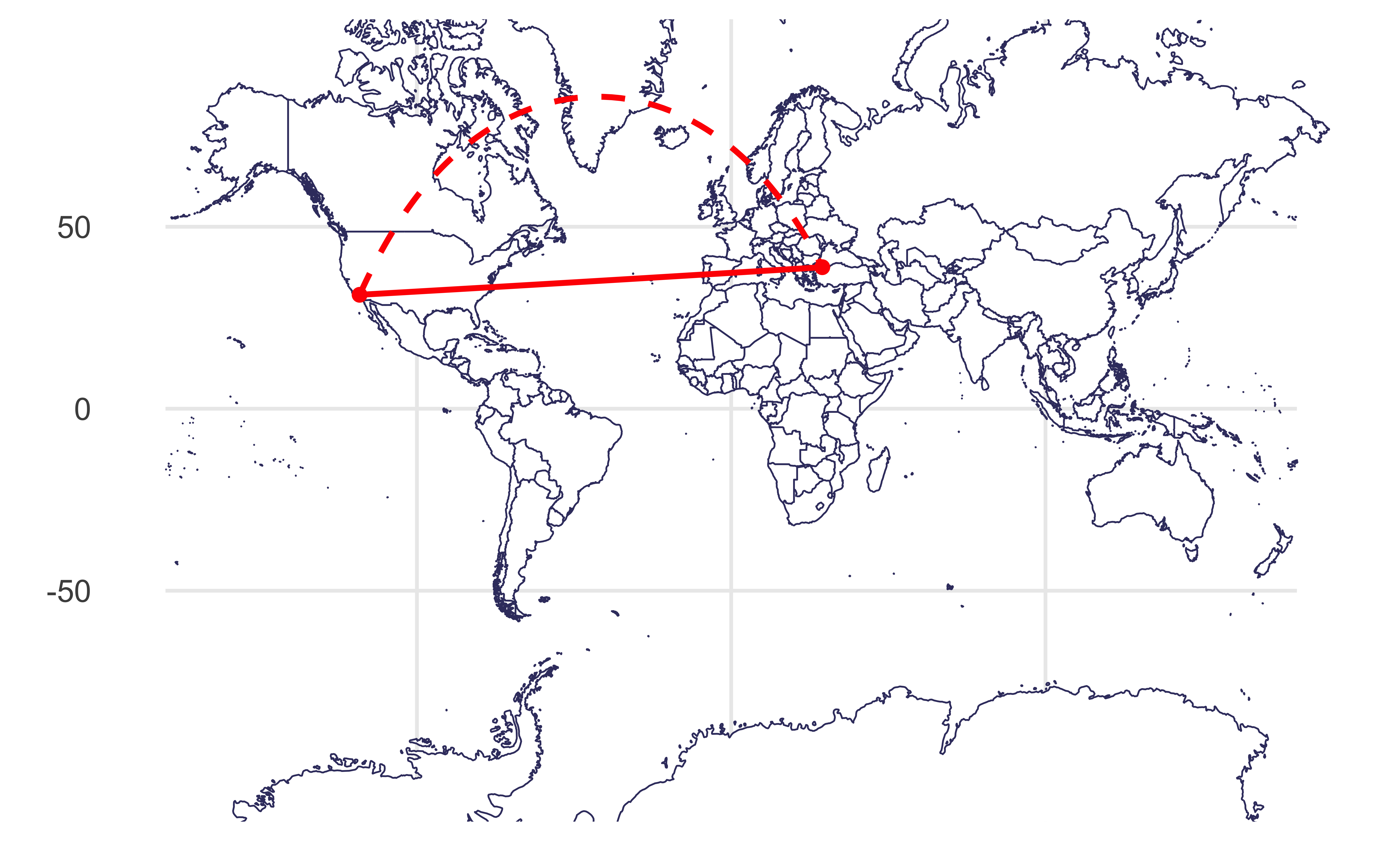
Draw a line between Istanbul and Los Angeles.
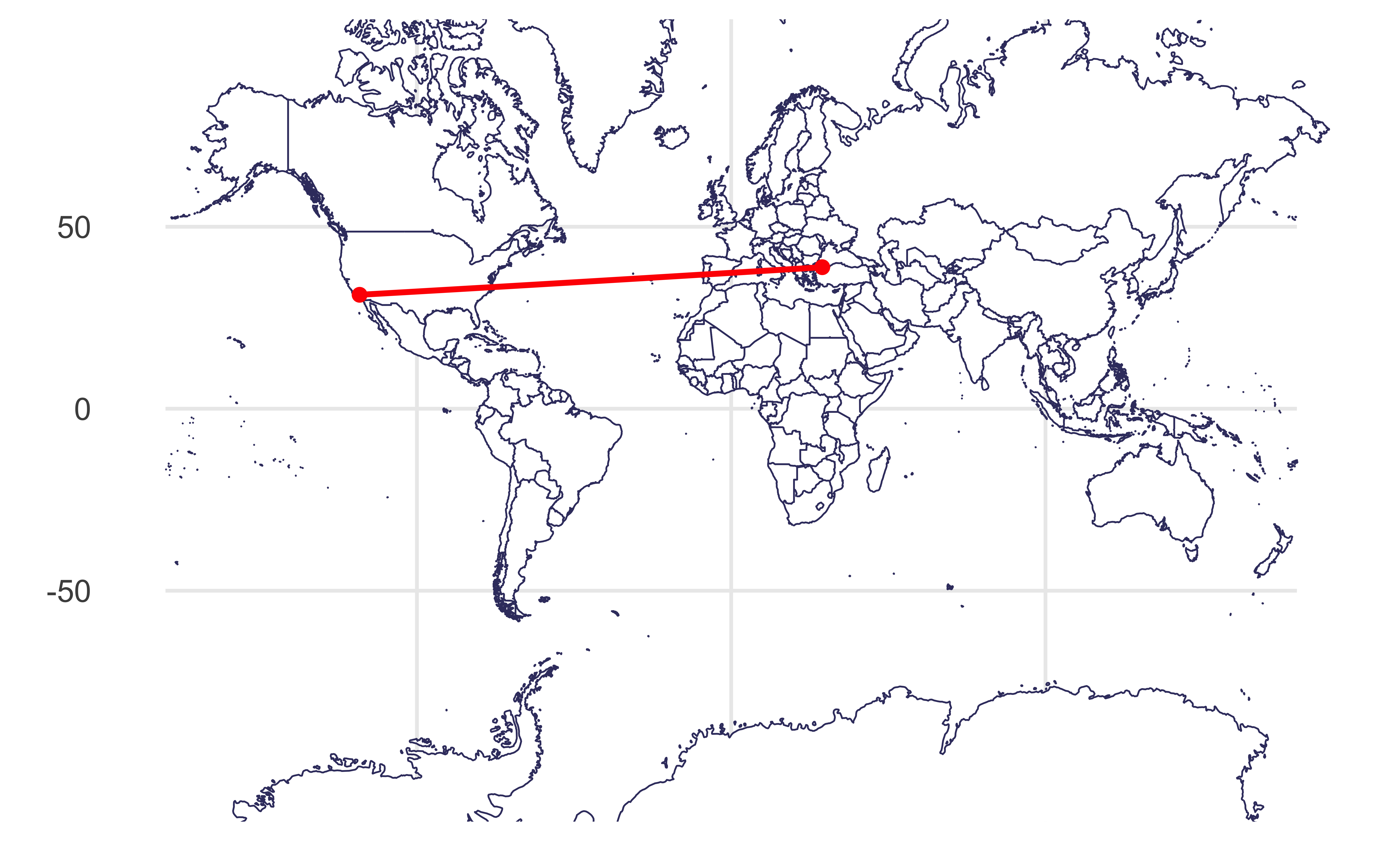
Visualizing distances
As if the earth is flat:
Visualizing distances
Based on a spherical model of the earth:
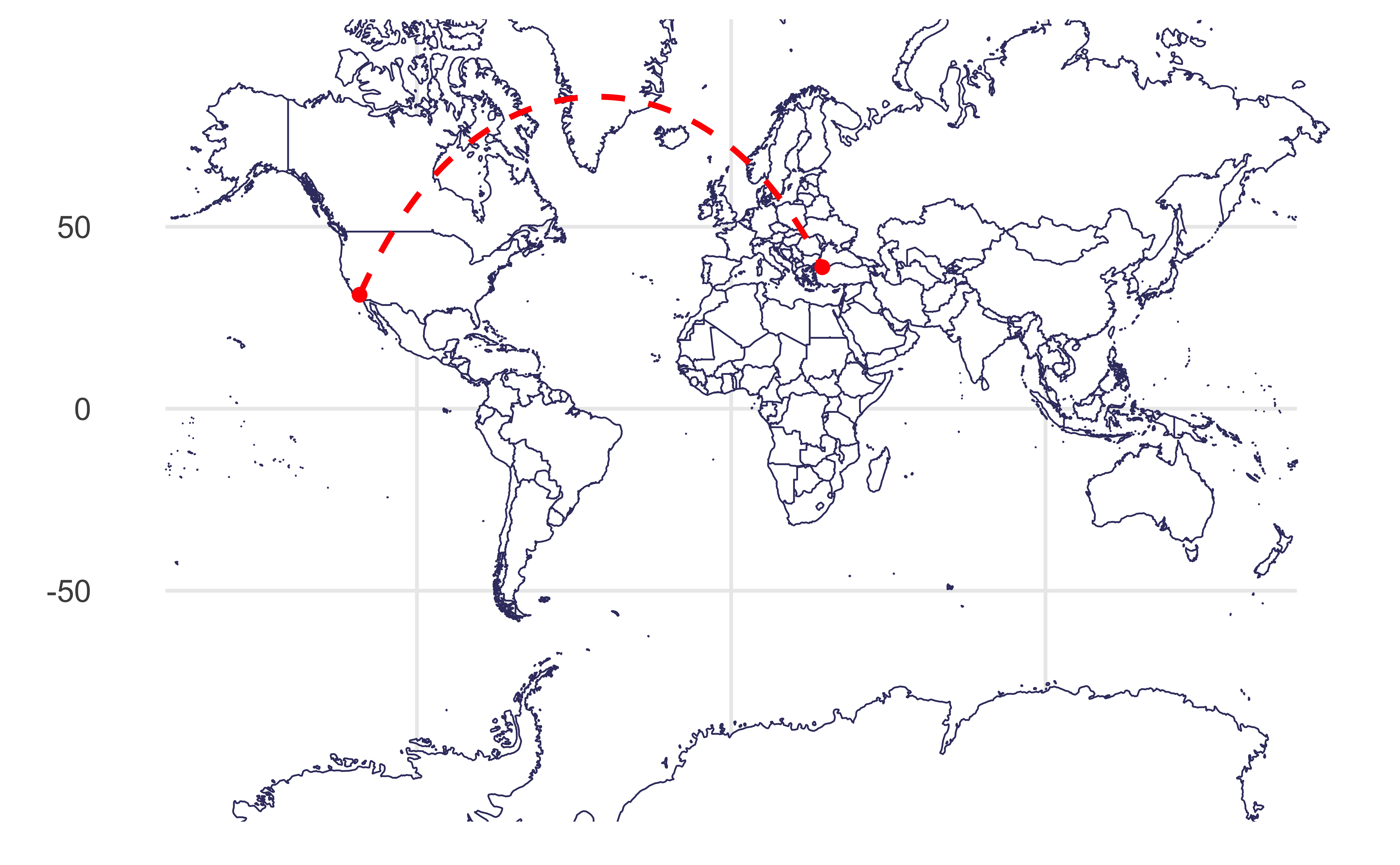
Plotting both distances
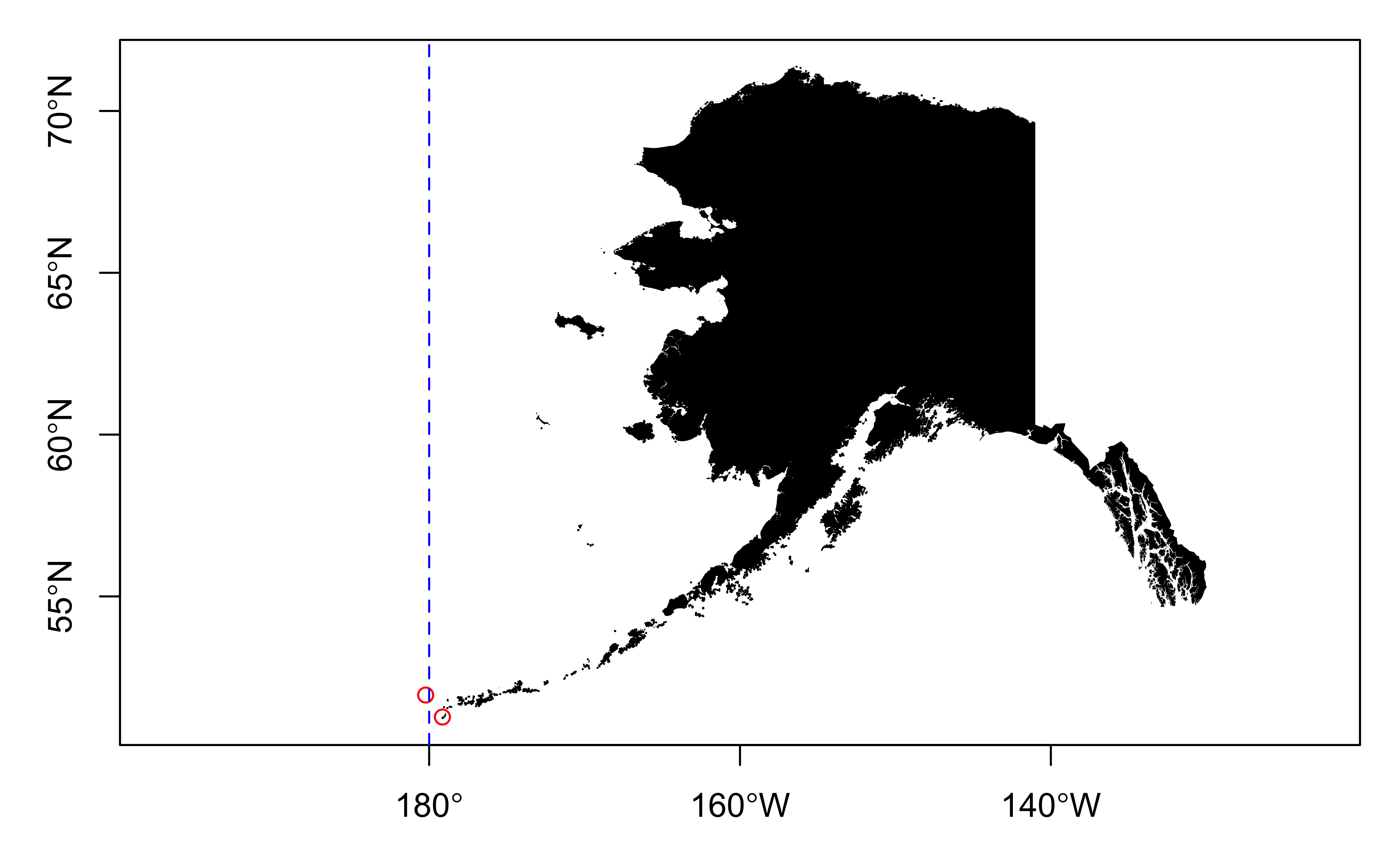
Dateline
Improve
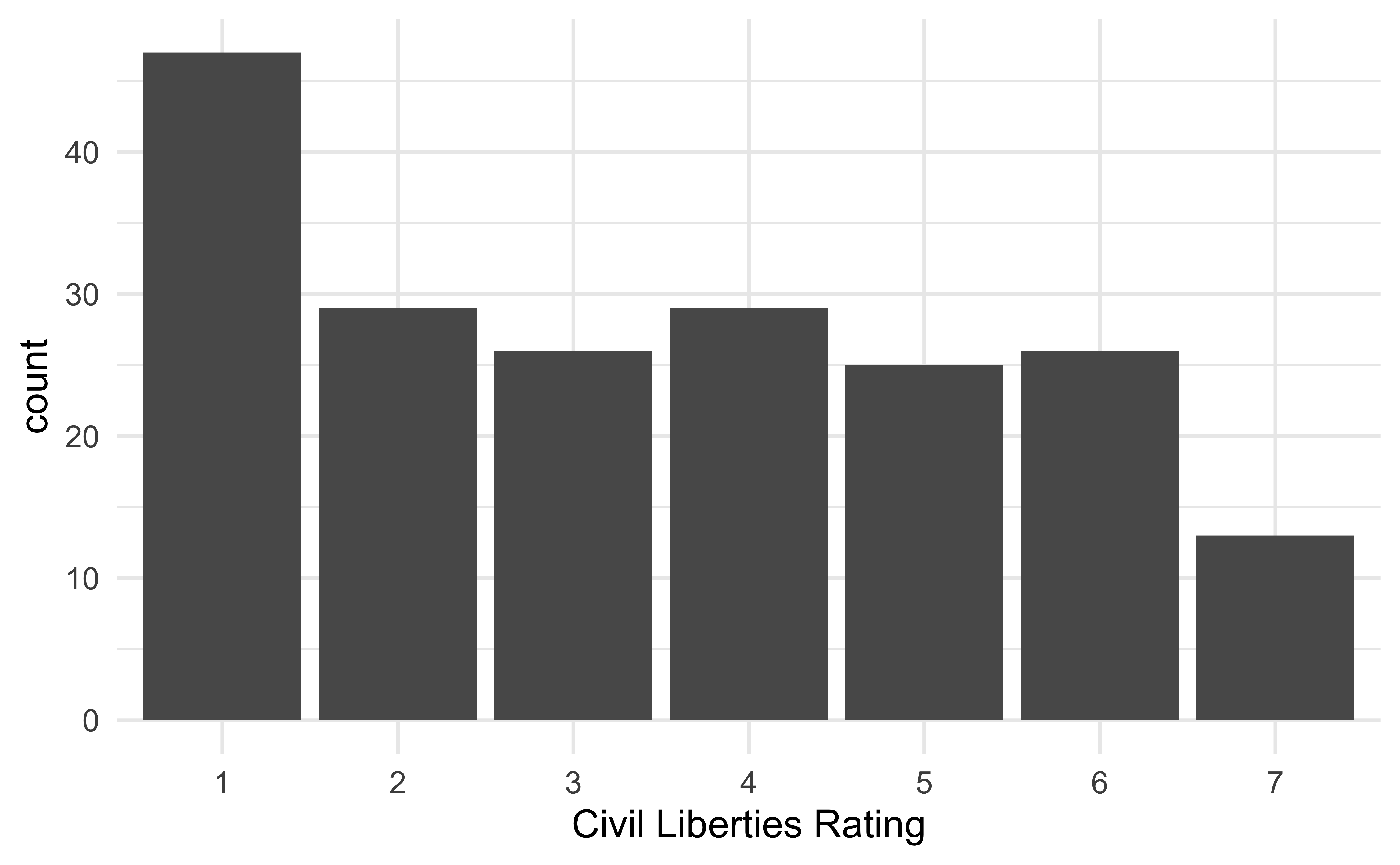
The following visualization shows the distribution civil liberties ratings (1 - greatest degree of freedom to 7 - smallest degree of freedom). This is, undoubtedly, not the best visualization we can make of these data. How can we improve it?
Mapping the world
Mapping freedom
What is missing/misleading about the following map?
Let’s map!

Facet by location
Warning: Removed 1802 rows containing non-finite values
(`stat_align()`).
Geofacet by state
Geofacet by state, with improvements
Geofacet by state + presidential election result
us_state_vaccinations |>
  left_join(election_2020, by = c("location" = "state")) |>
  ggplot(aes(x = date, y = people_fully_vaccinated_per_hundred)) +
  geom_area(aes(fill = win)) +
  facet_geo(~location) +
  scale_y_continuous(limits = c(0, 100), breaks = c(0, 50, 100), minor_breaks = c(25, 75)) +
  scale_x_date(breaks = c(ymd("2021-01-01", "2021-05-01", "2021-09-01")), date_labels = "%b") +
  scale_fill_manual(values = c("#2D69A1", "#BD3028")) +
  labs(
    x = NULL, y = NULL,
    title = "Covid-19 vaccination rate in the US",
    subtitle = "Daily number of people fully vaccinated, per hundred",
    caption = "Source: Our World in Data",
    fill = "2020 Presidential\nElection"
  ) +
  theme(
    strip.text.x = element_text(size = 7),
    axis.text = element_text(size = 8),
    plot.title.position = "plot",
    legend.position = c(0.93, 0.15),
    legend.text = element_text(size = 9),
    legend.title = element_text(size = 11),
    legend.background = element_rect(color = "gray", size = 0.5)
)![]()
Geofacet by state + presidential election result