Du Bois visualizations
Lecture 11
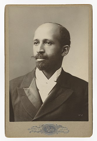
W.E.B. Du Bois
W.E.B. (William Edward Burghardt) Du Bois (February 23, 1868 – August 27, 1963) was a professor of history, sociology, and economics at Atlanta University and one of the founders of the NAACP in 1909.
1900 Paris Exposition
The Exposition Universelle of 1900, better known in English as the 1900 Paris Exposition, was a world’s fair held in Paris, France, in November 1900, to celebrate the achievements of the past century and to accelerate development into the next.
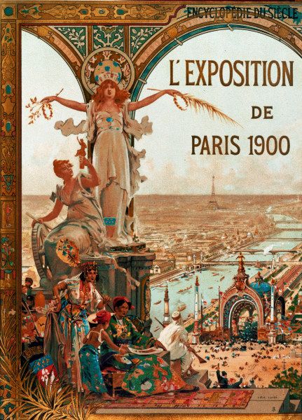
1900 Paris Exposition
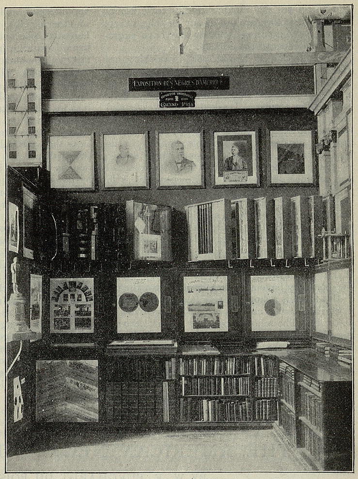
Du Bois’s visualizations were part of the Exposition des Nègres d’Amérique (The Exhibit of American Negroes), an exhibit organized by newspaper editor Thomas Junius Calloway.
The goal of the exhibit was to tell the story of African Americans after Emancipation using a variety of items including texts, portraits, and data visualizations.
The exhibit highlighted the progress made by African Americans, and Du Bois, in particular, used data and visualizations to counter the “narrative of Black inferiority” and to humanize the African American experience.
Visualizations and photographs are available in the Library of Congress digital collection.
Proportion of Freemen and Slaves
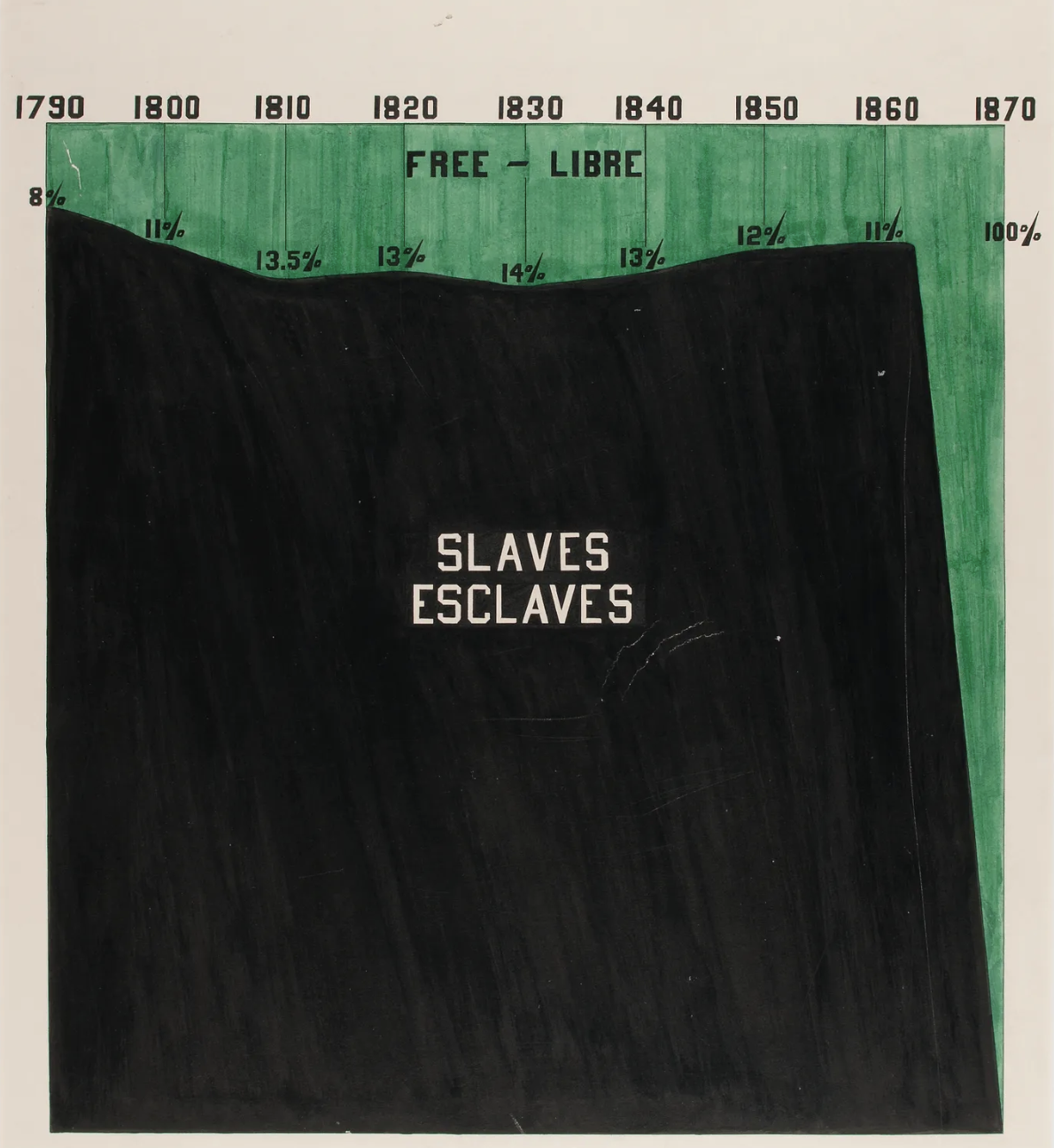
“Proportion of Freemen and Slaves among American Negroes”, 1900, via Library of Congress Prints and Photographs Division
Illiteracy
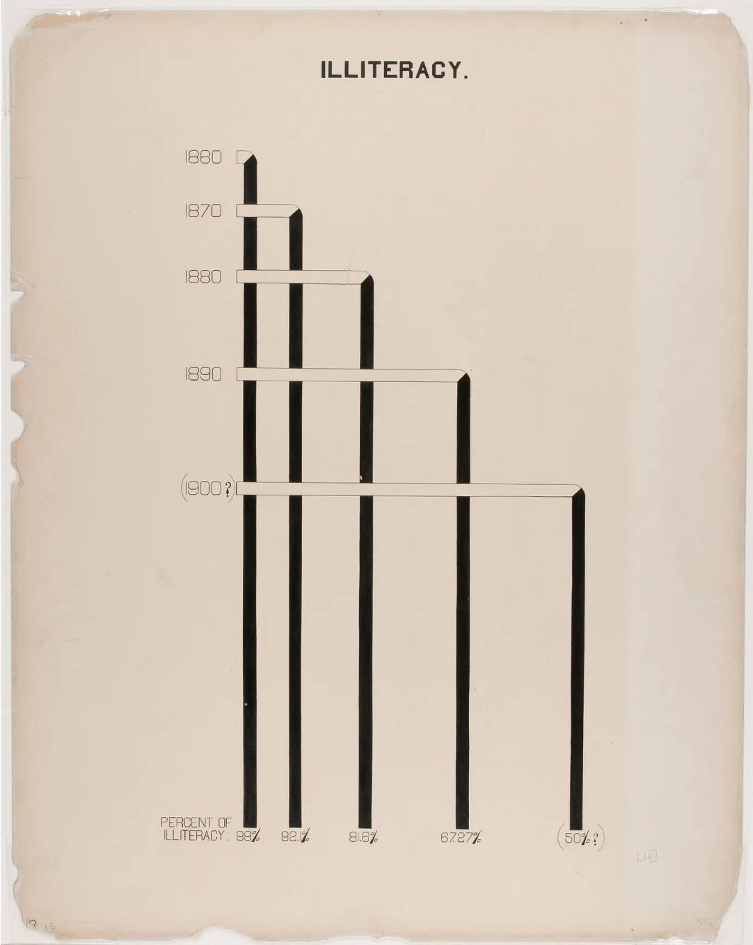
“Illiteracy” 1900, via Library of Congress Prints and Photographs Division
City and rural population
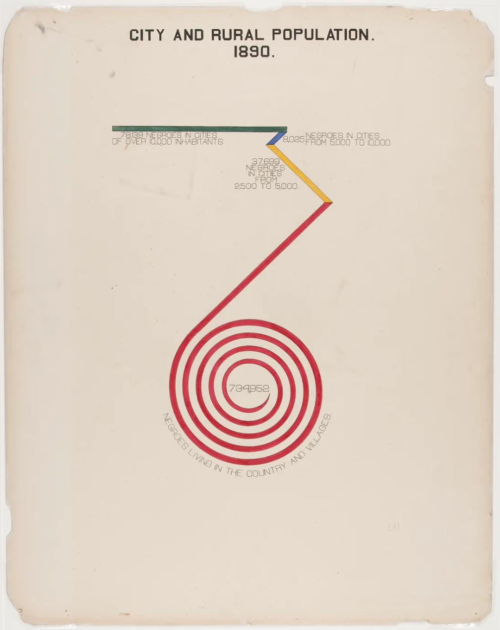
“City and Rural Population. 1890” 1900, via Library of Congress Prints and Photographs Division
Recreation activities
The most prevalent type of visualizations created by W. E. B. Du Bois are bar charts, which inspired your hw-03 recreation challenge.
Further reading
Battle-Baptiste, W., & Rusert, B. (Eds.). (2018). W. E. B. Du Bois’s Data Portraits: Visualizing Black America. Chronicle Books.
Recreations of Du Bois’s Data Portraits GitHub repository: github.com/ajstarks/dubois-data-portraits
Starks, A. (2019, August 21). Recreating W.E.B Du Bois’s Data Portraits. Medium. medium.com/nightingale/recreating-w-e-b-du-boiss-data-portraits-87dd36096f34
Starks, A. (2022, February 1). The #DuBois Challenge. Nightingale. nightingaledvs.com/the-dubois-challenge
![]()