# load packages
library(tidyverse)
library(ggrepel)
library(patchwork)
library(ggtext)

# set theme for ggplot2
ggplot2::theme_set(ggplot2::theme_minimal(base_size = 16))

# set figure parameters for knitr
knitr::opts_chunk$set(
  fig.width = 7, # 7" width
  fig.asp = 0.618, # the golden ratio
  fig.retina = 3, # dpi multiplier for displaying HTML output on retina
  fig.align = "center", # center align figures
  dpi = 300 # higher dpi, sharper image
)Presentation ready plots
Lecture 9
University of Arizona
INFO 526 - Summer 2024
Setup
Telling a story
Multiple ways of telling a story
Sequential plots: Motivation, then resolution
A single plot: Resolution, and hidden in it motivation
Project note: you’re asked to create two plots per question. One possible approach: Start with a plot showing the raw data, and show derived quantities (e.g. percent increases, averages, coefficients of fitted models) in the subsequent plot.
Simplicity vs. complexity
When you’re trying to show too much data at once you may end up not showing anything.
Never assume your audience can rapidly process complex visual displays
Don’t add variables to your plot that are tangential to your story
Don’t jump straight to a highly complex figure; first show an easily digestible subset (e.g., show one facet first)
Aim for memorable, but clear
Project note: Make sure to leave time to iterate on your plots after you practice your presentation. If certain plots are getting too wordy to explain, take time to simplify them!
Consistency vs. repetitiveness
Be consistent but don’t be repetitive.
Use consistent features throughout plots (e.g., same color represents same level on all plots)
Aim to use a different type of visualization for each distinct analysis
Designing effective visualizations
Keep it simple
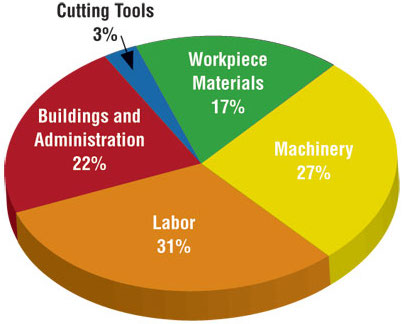
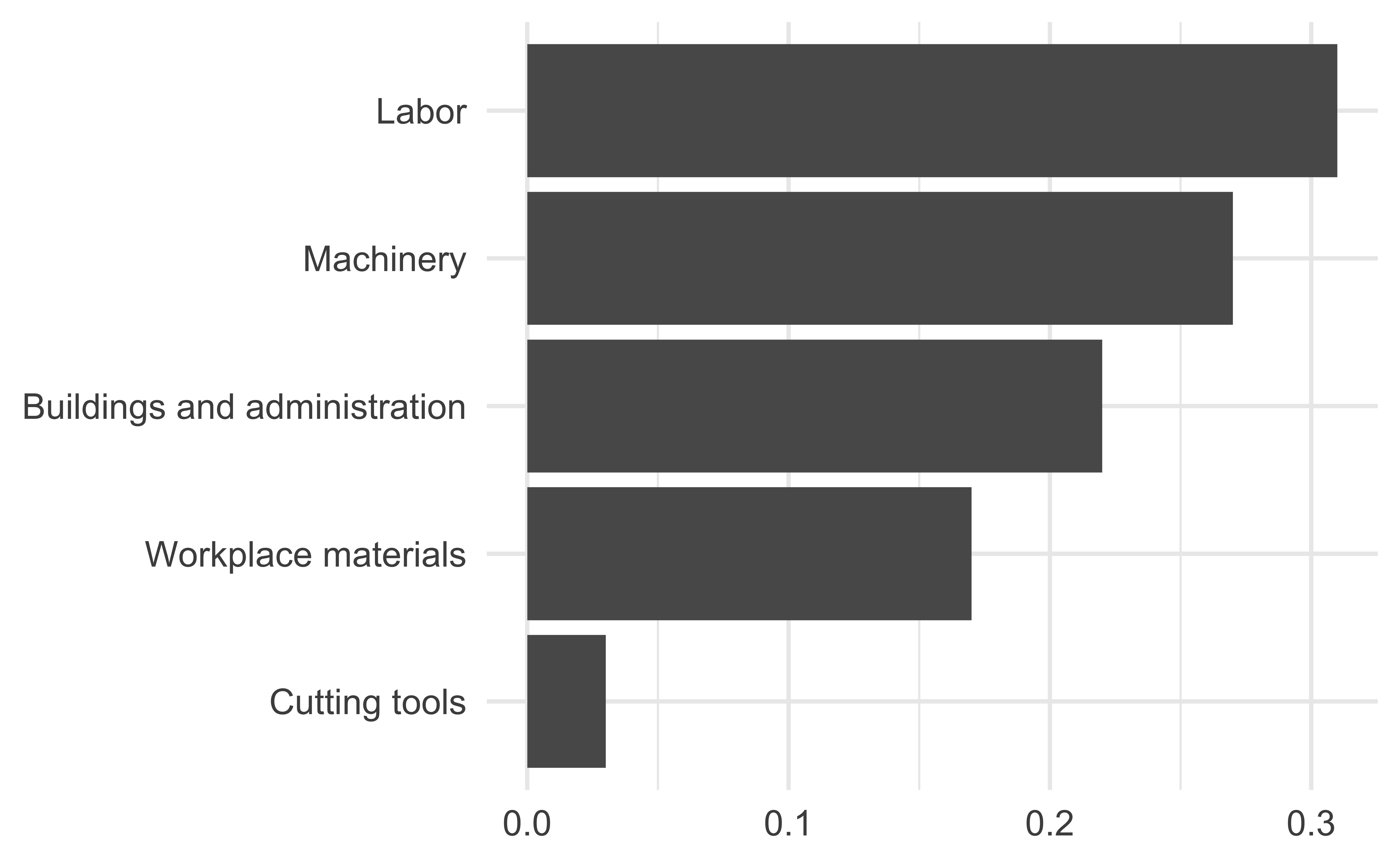
Judging relative area

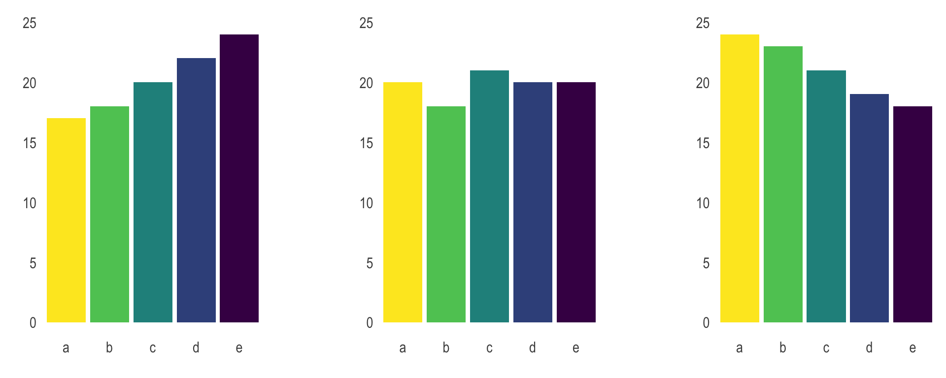
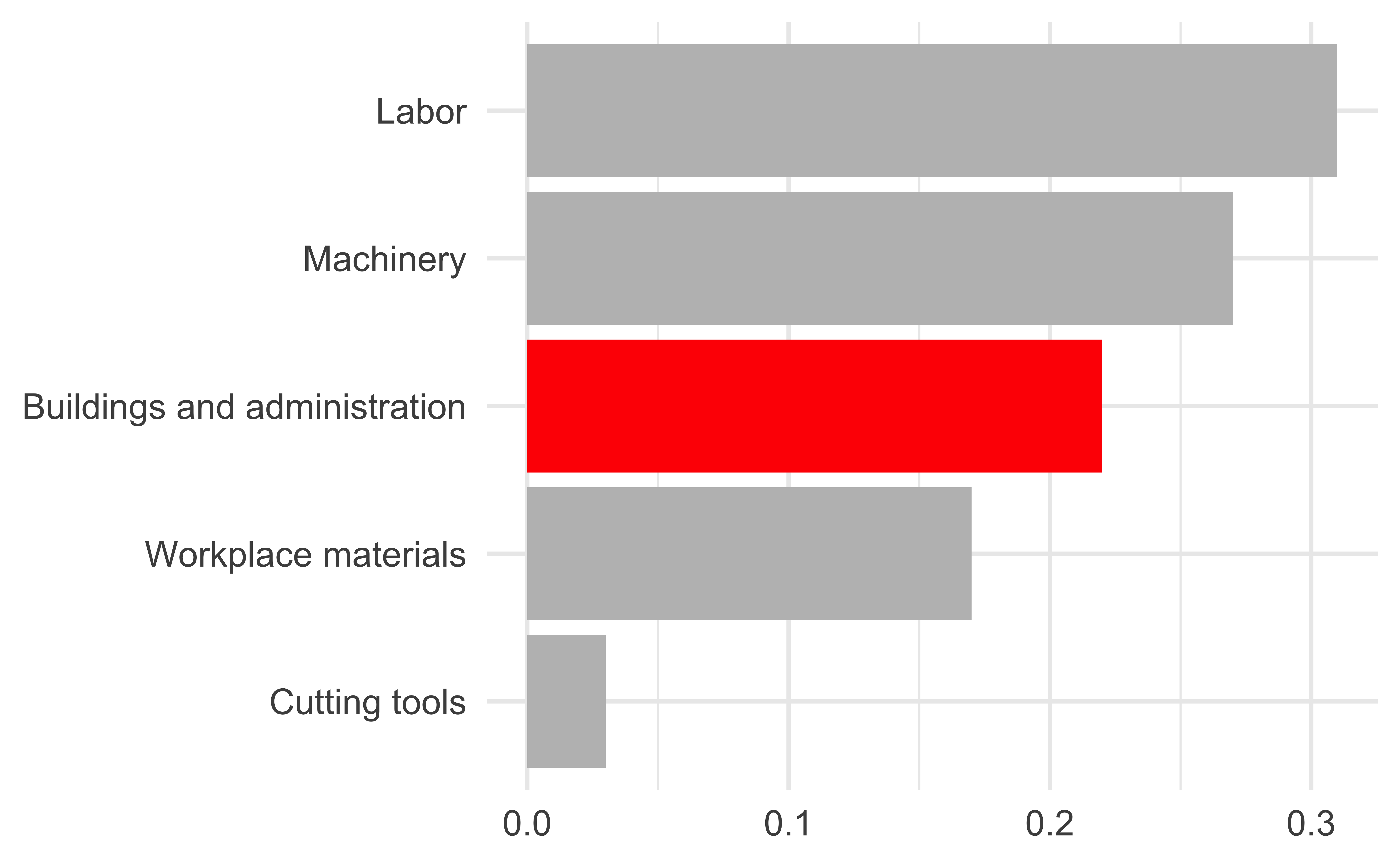
Use color to draw attention
Tell a story
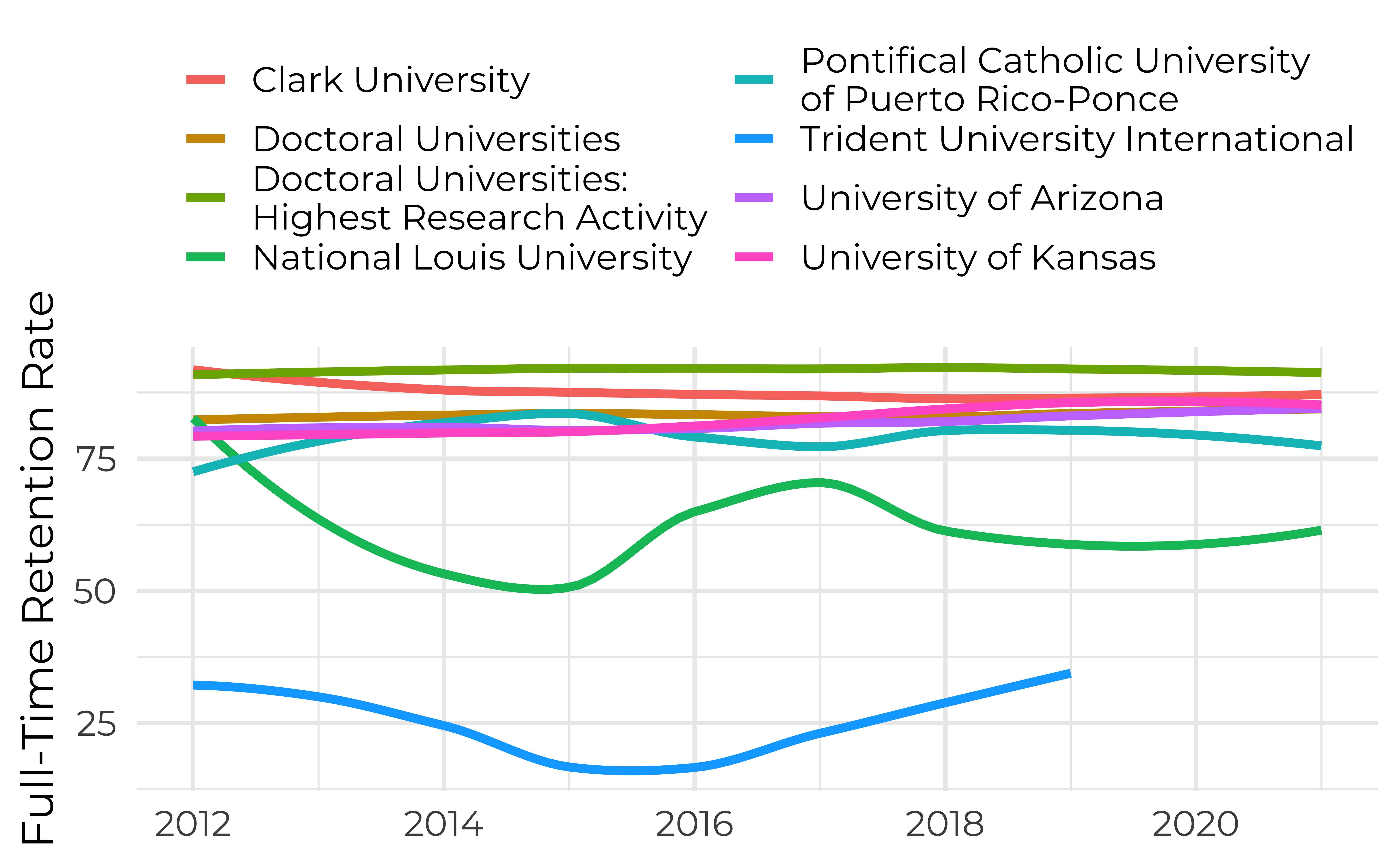
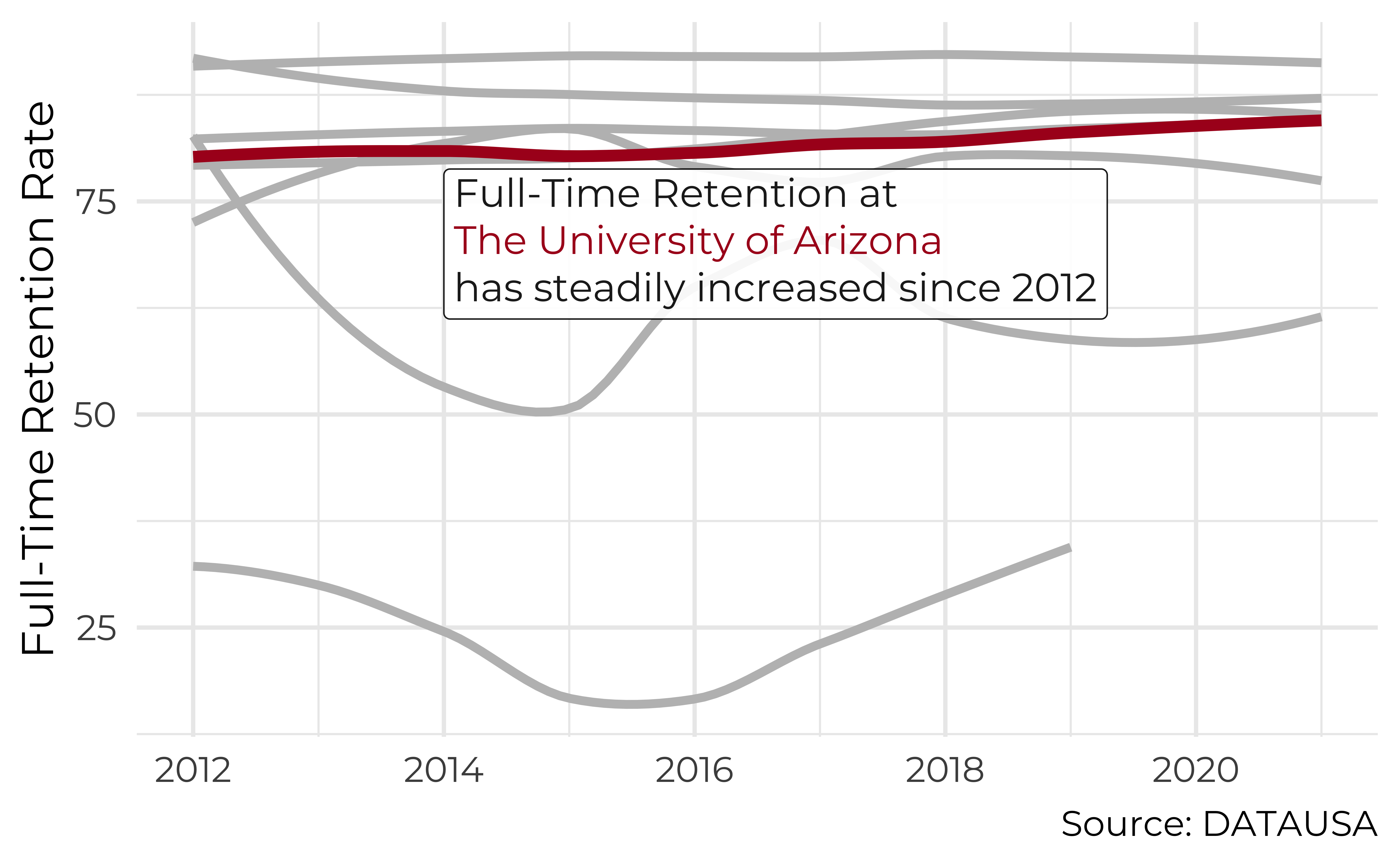
Leave out non-story details
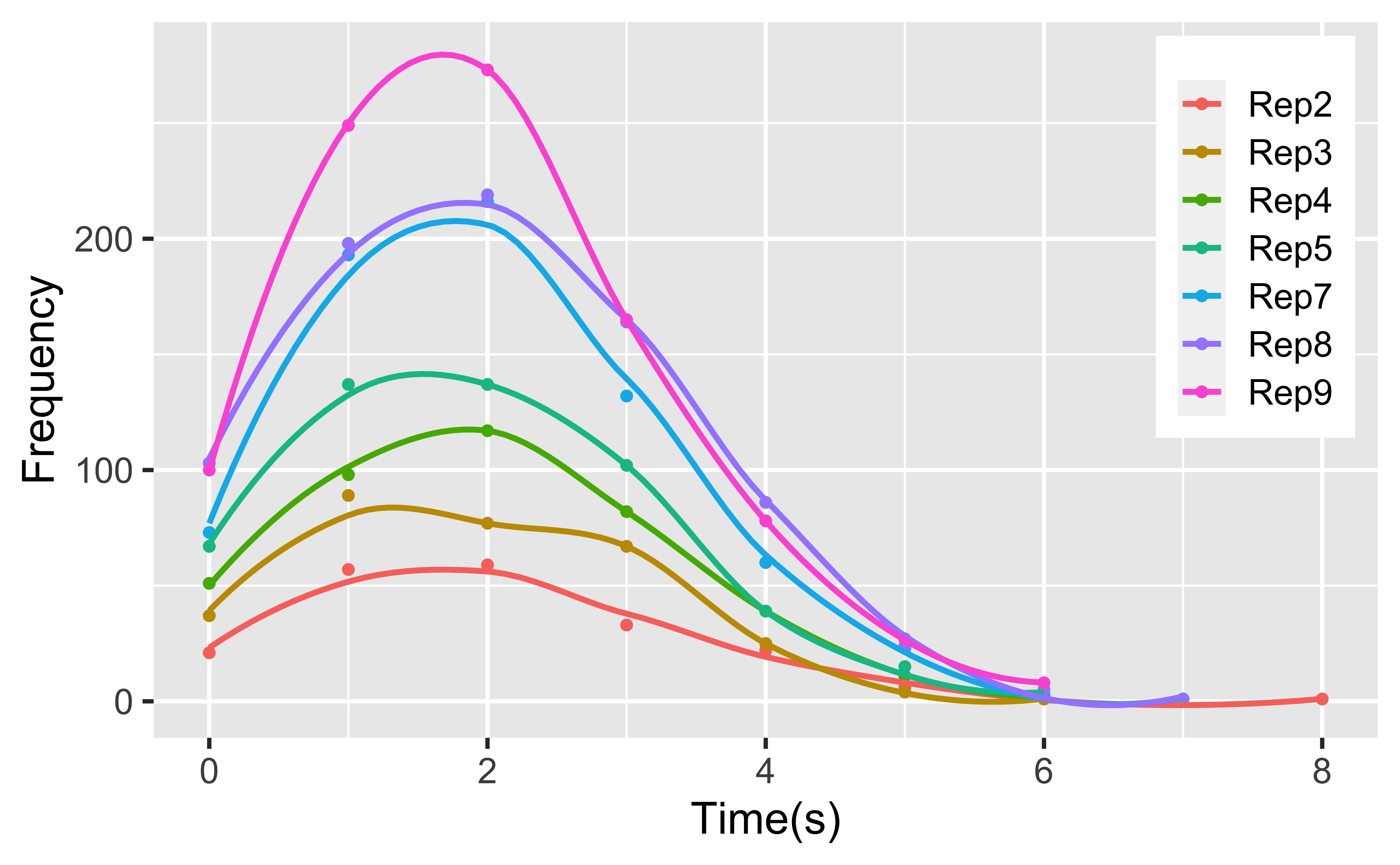
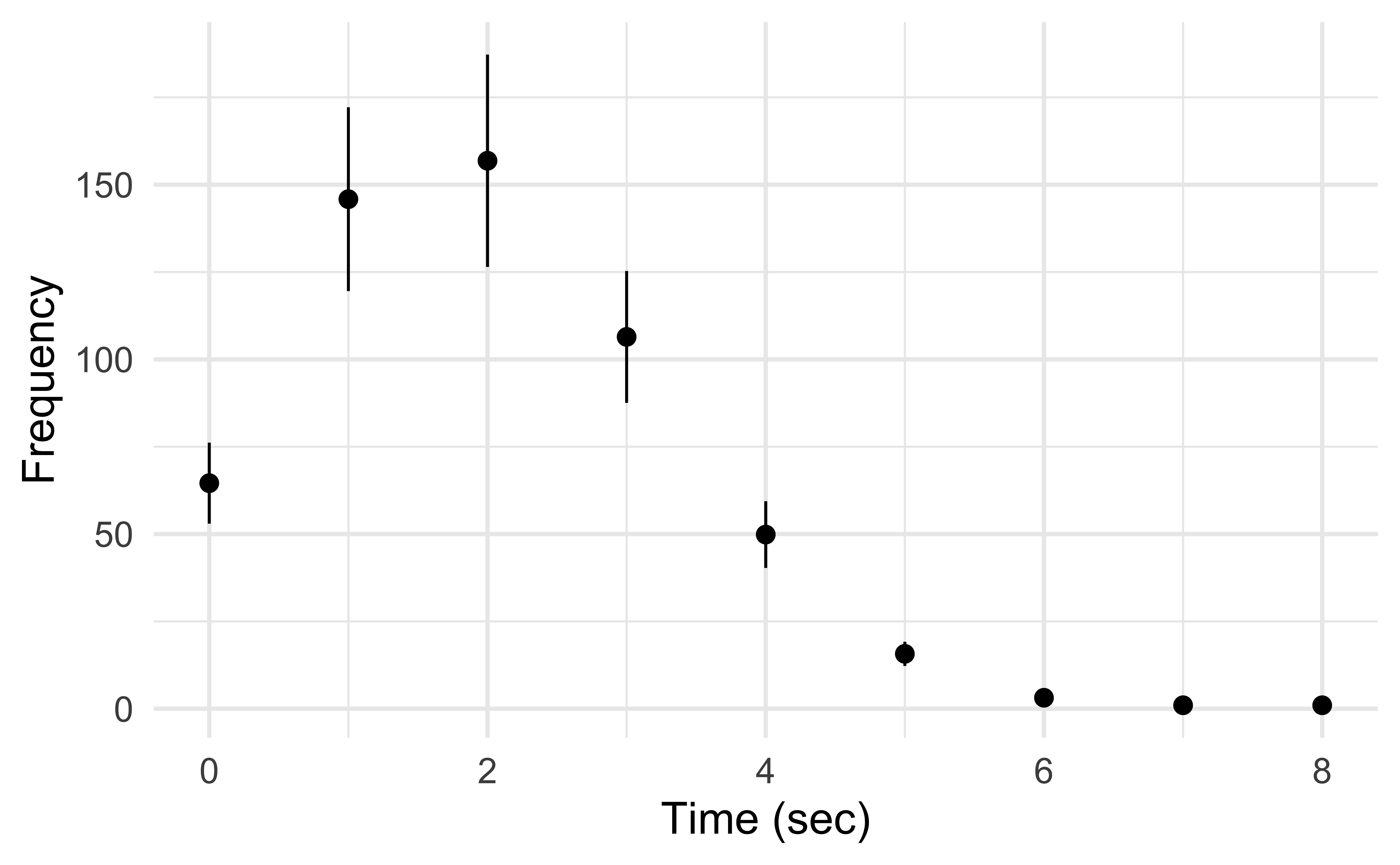
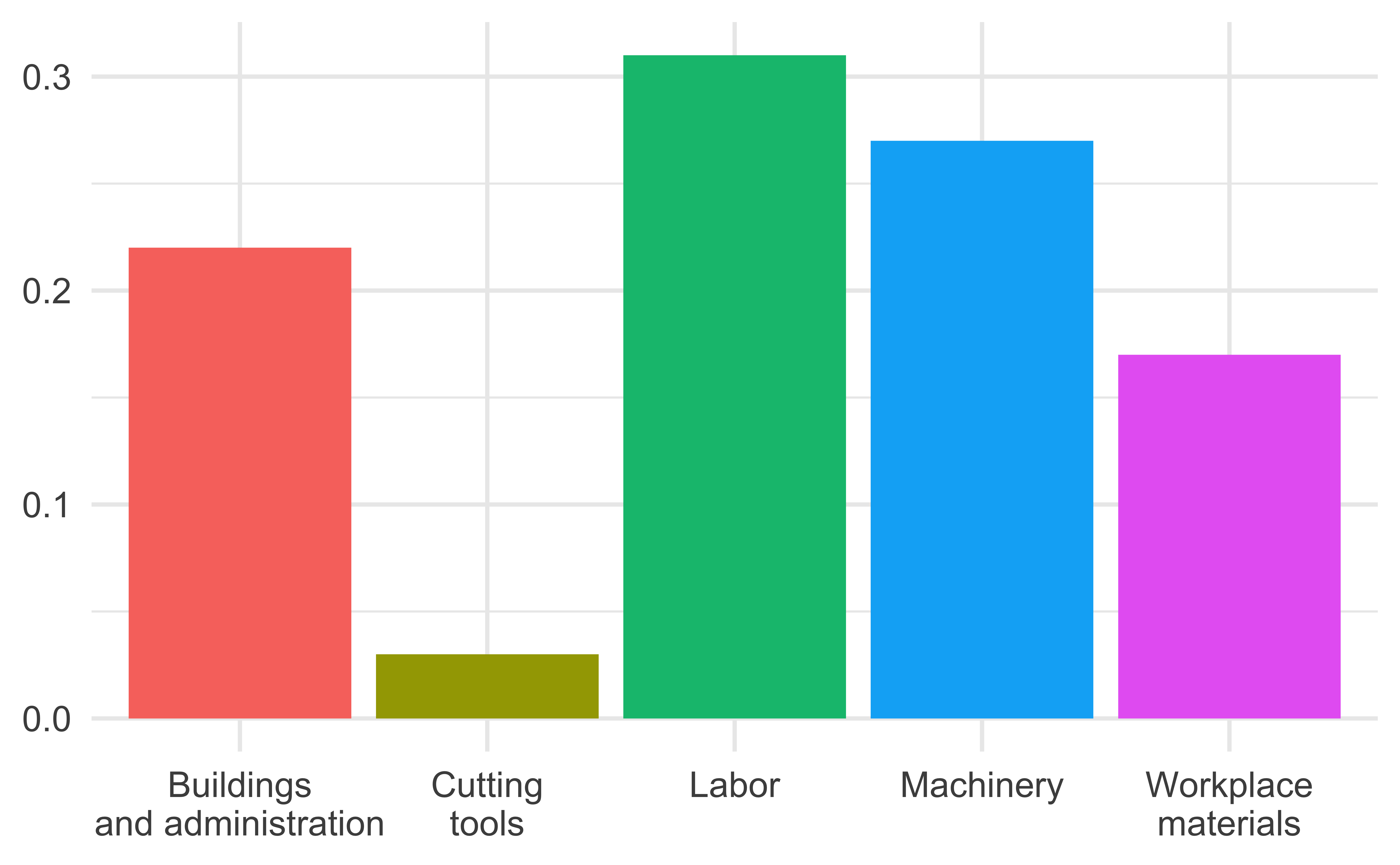
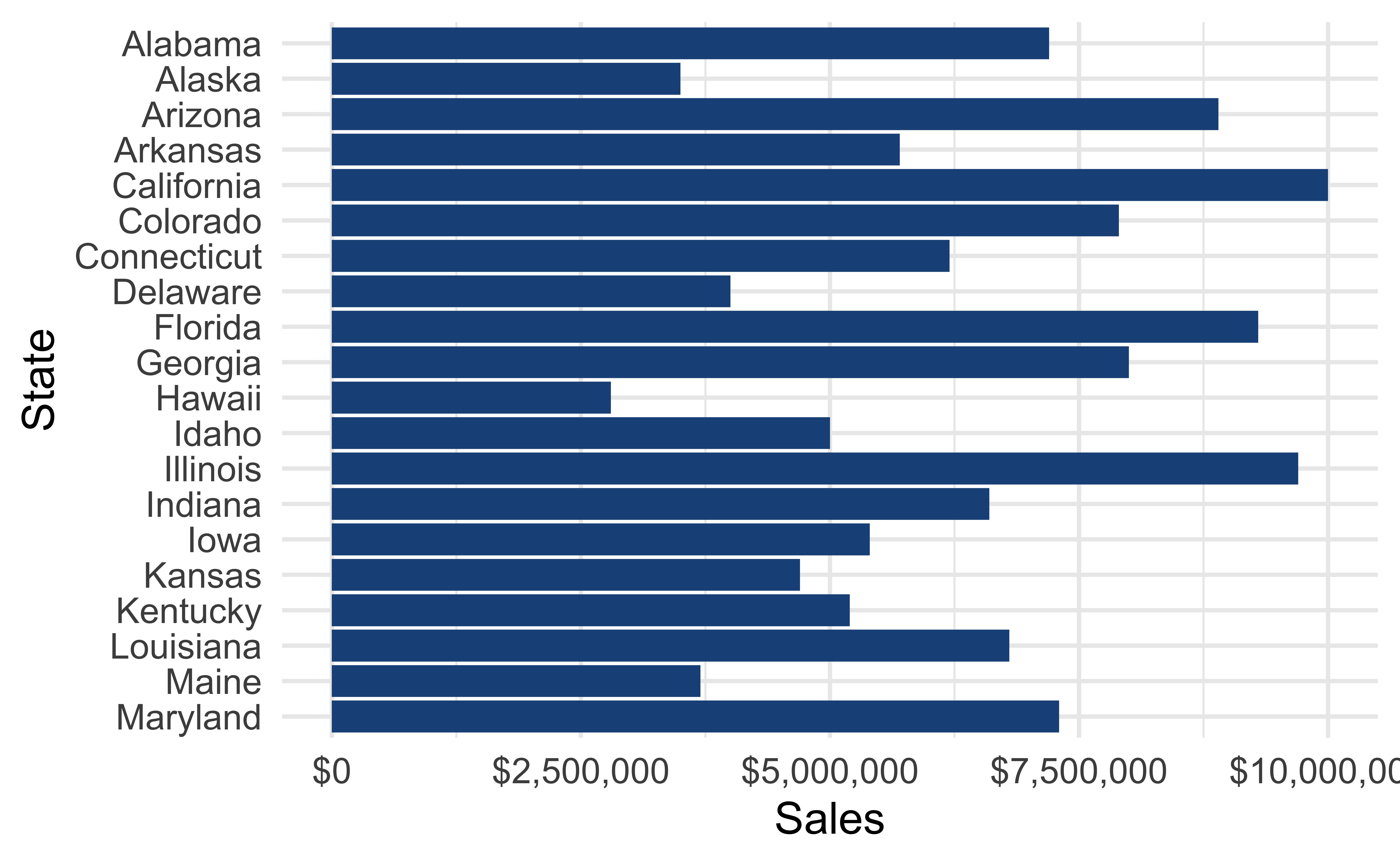
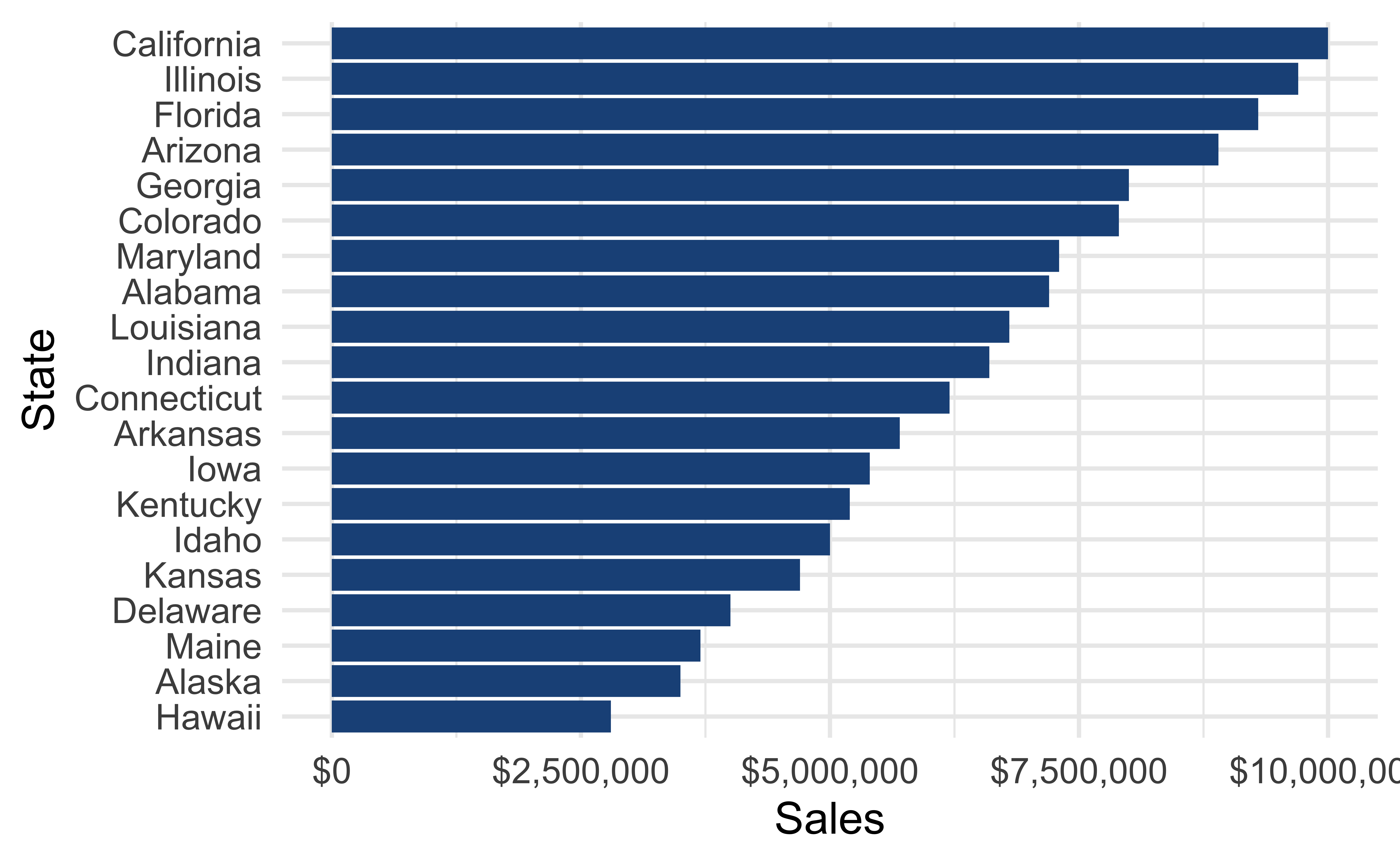
Order matters
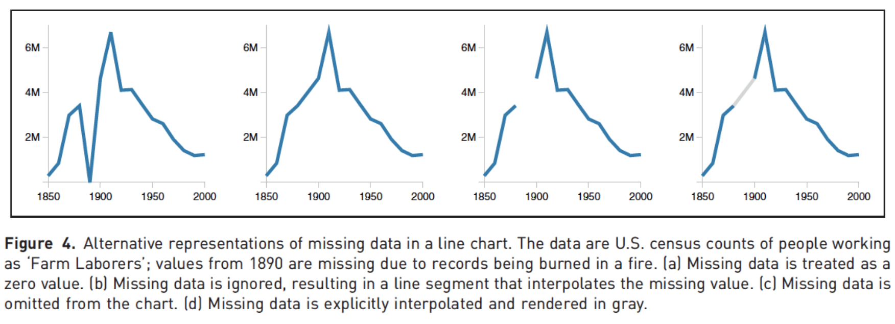
Clearly indicate missing data
Reduce cognitive load
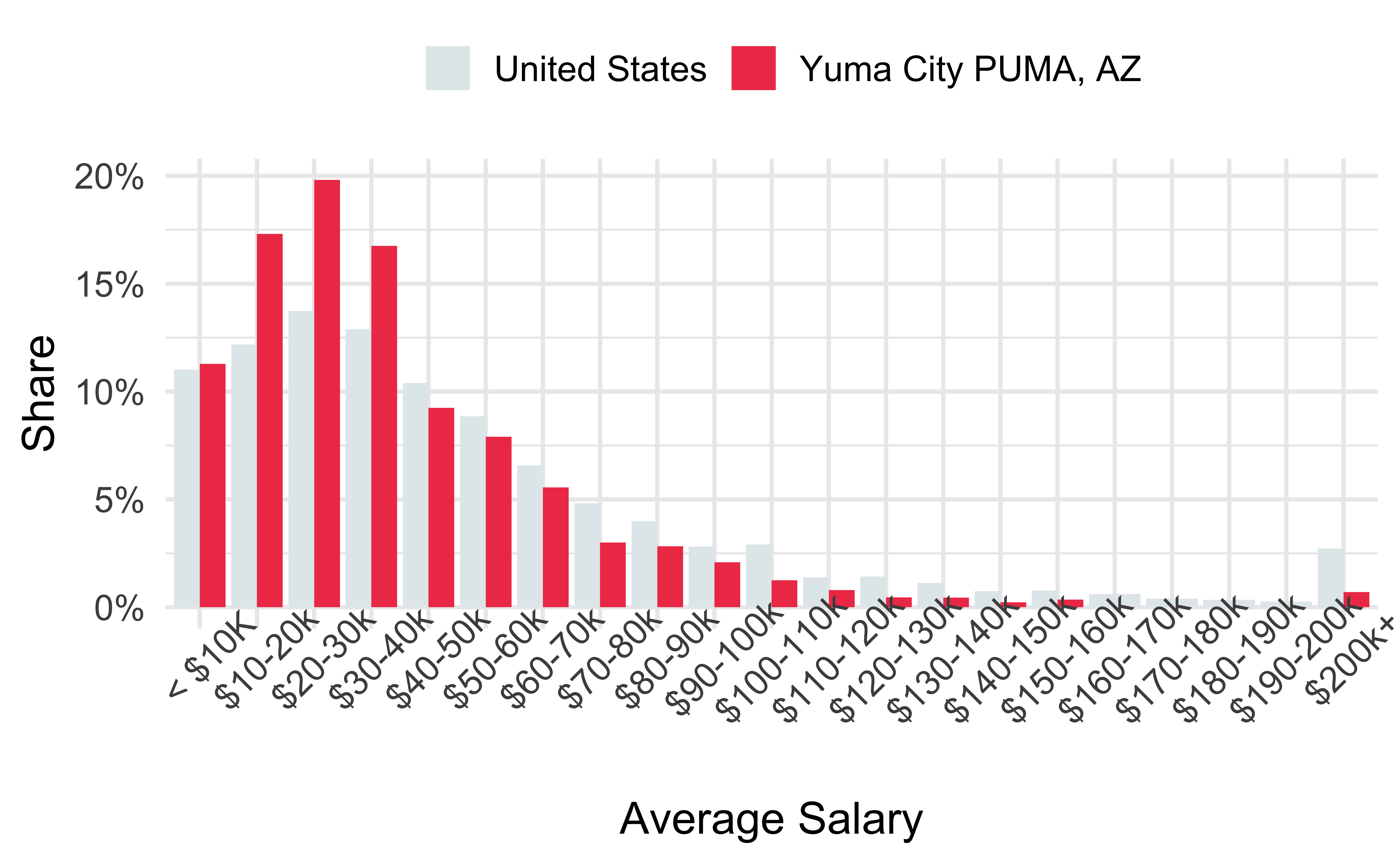
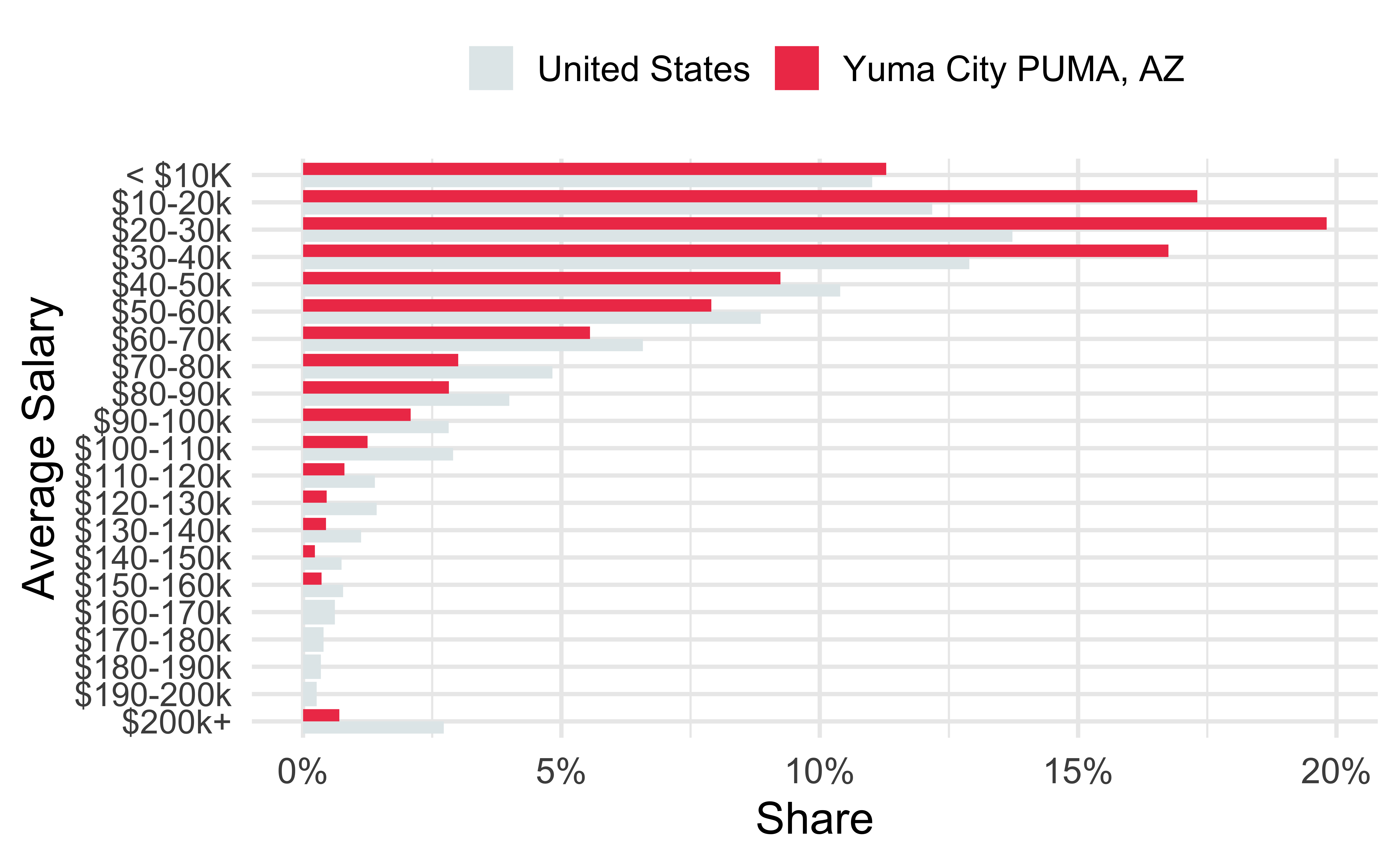
Use descriptive titles
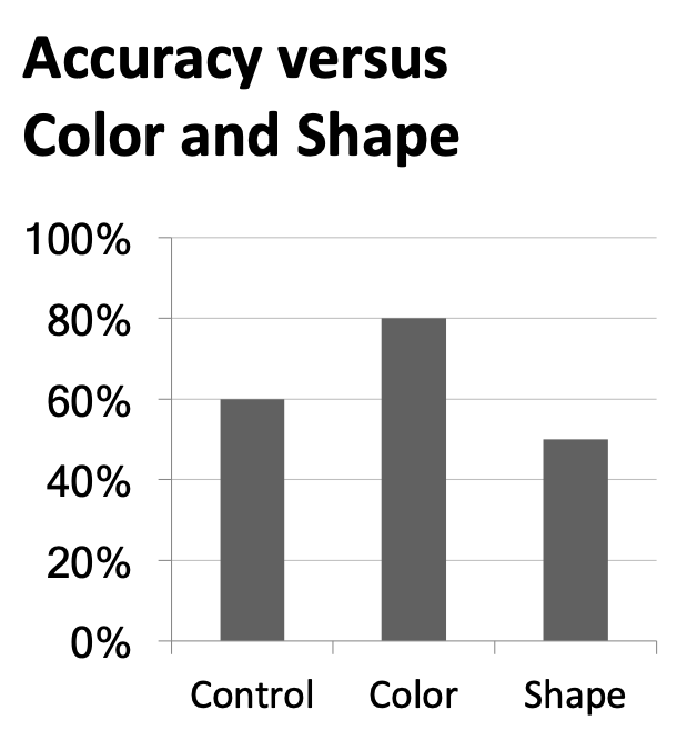
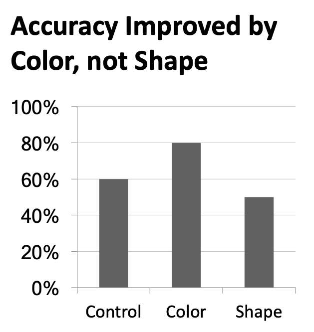
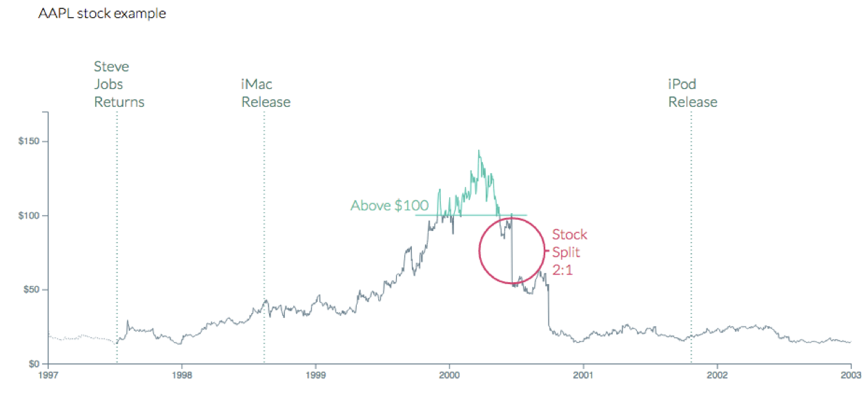
Annotate figures
Plot layout
Sample plots
p_hist <- ggplot(mtcars, aes(x = mpg)) +
  geom_histogram(binwidth = 2)
p_box <- ggplot(mtcars, aes(x = factor(vs), y = mpg)) +
  geom_boxplot()
p_scatter <- ggplot(mtcars, aes(x = disp, y = mpg)) +
  geom_point()
p_text <- mtcars |>
  rownames_to_column() |>
  ggplot(aes(x = disp, y = mpg)) +
  geom_text_repel(aes(label = rowname)) +
  coord_cartesian(clip = "off")
Slide with single plot, little text
The plot will fill the empty space in the slide.

Slide with single plot, lots of text
If there is more text on the slide
The plot will shrink
To make room for the text
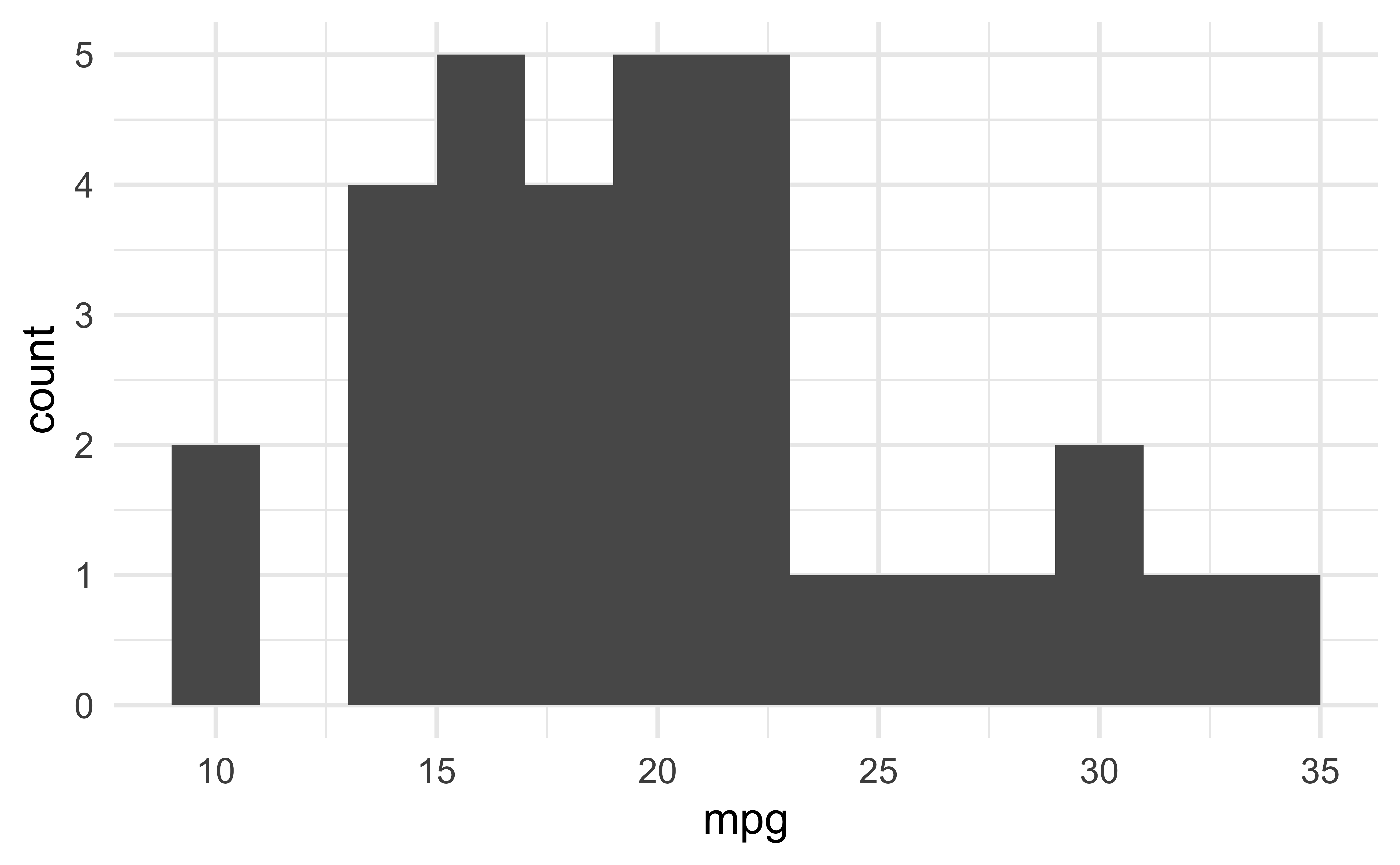
Small fig-width
For a zoomed-in look
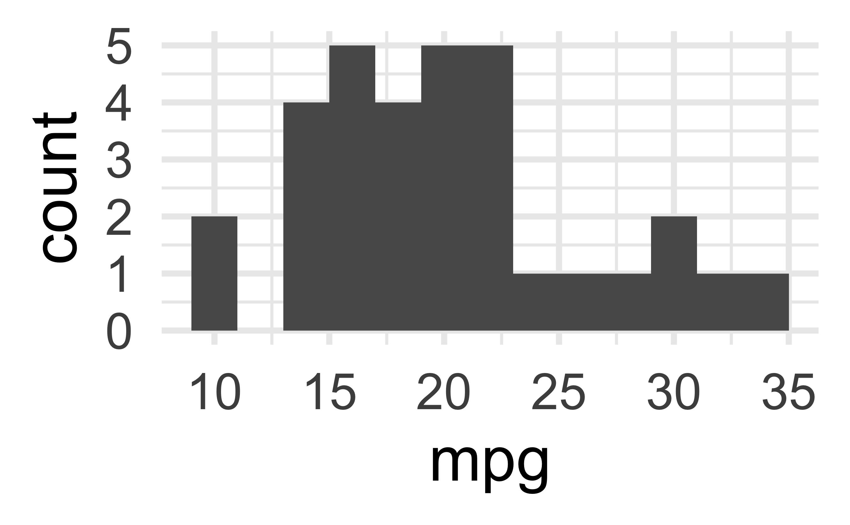
Large fig-width
For a zoomed-out look
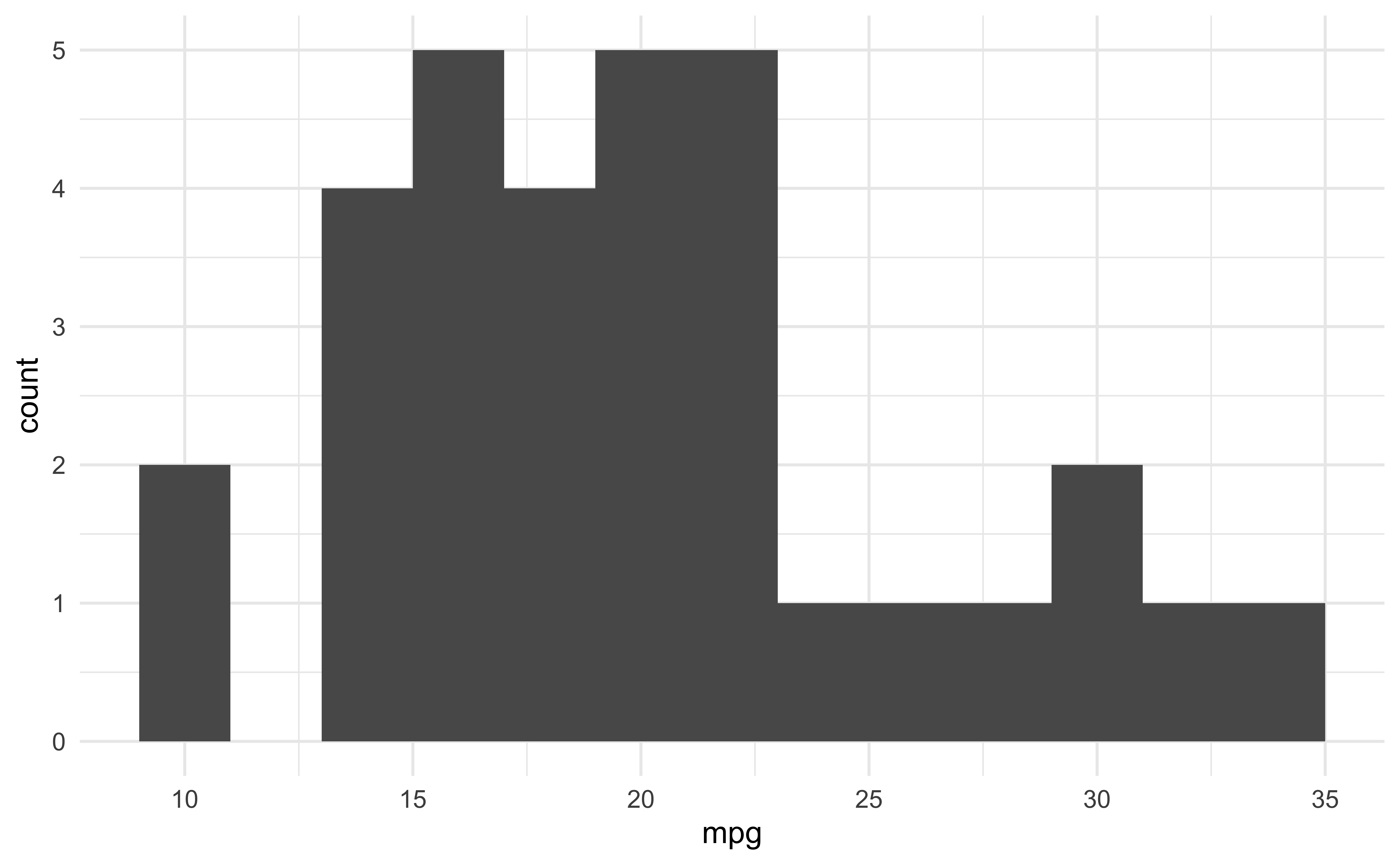
fig-width affects text size
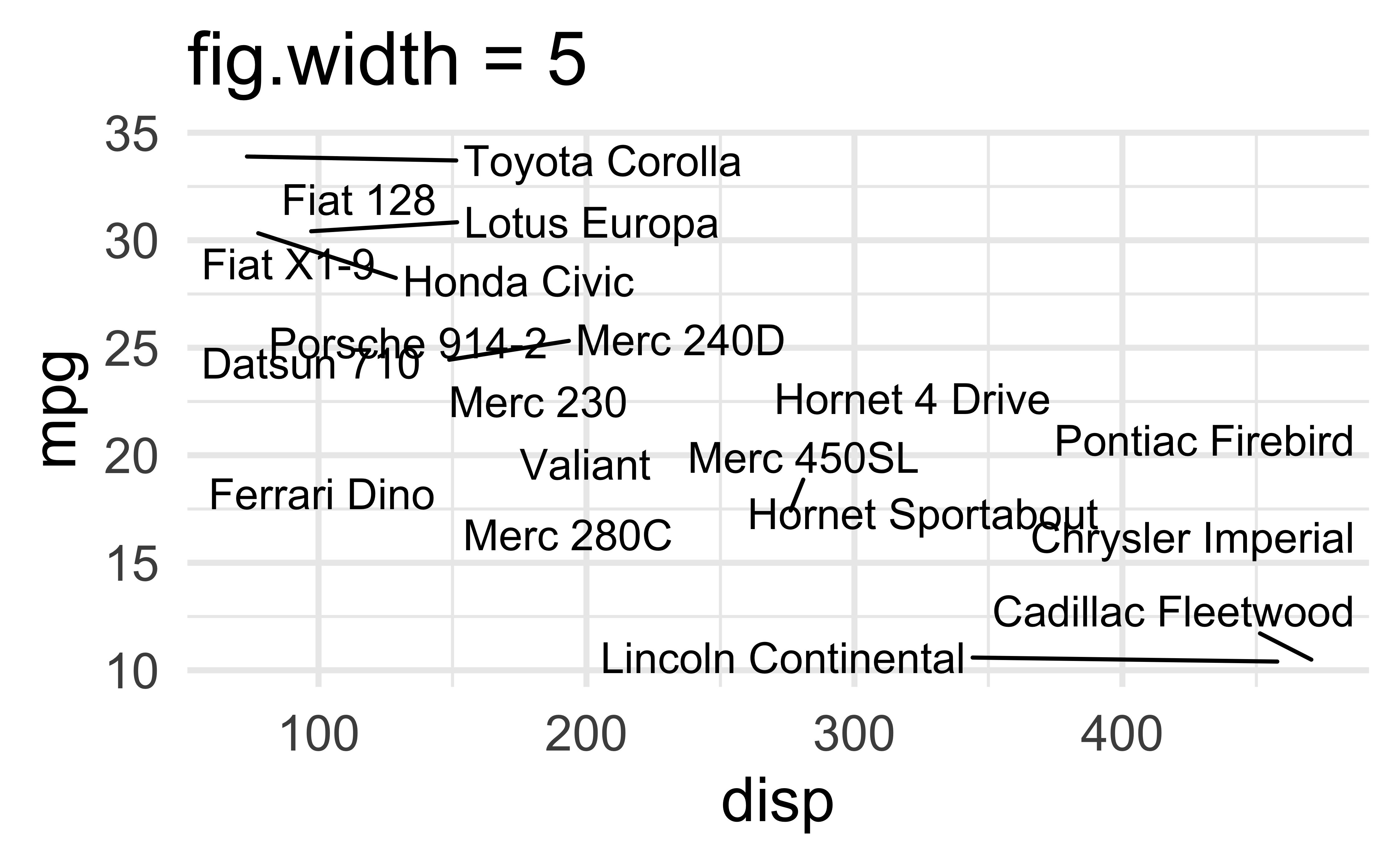
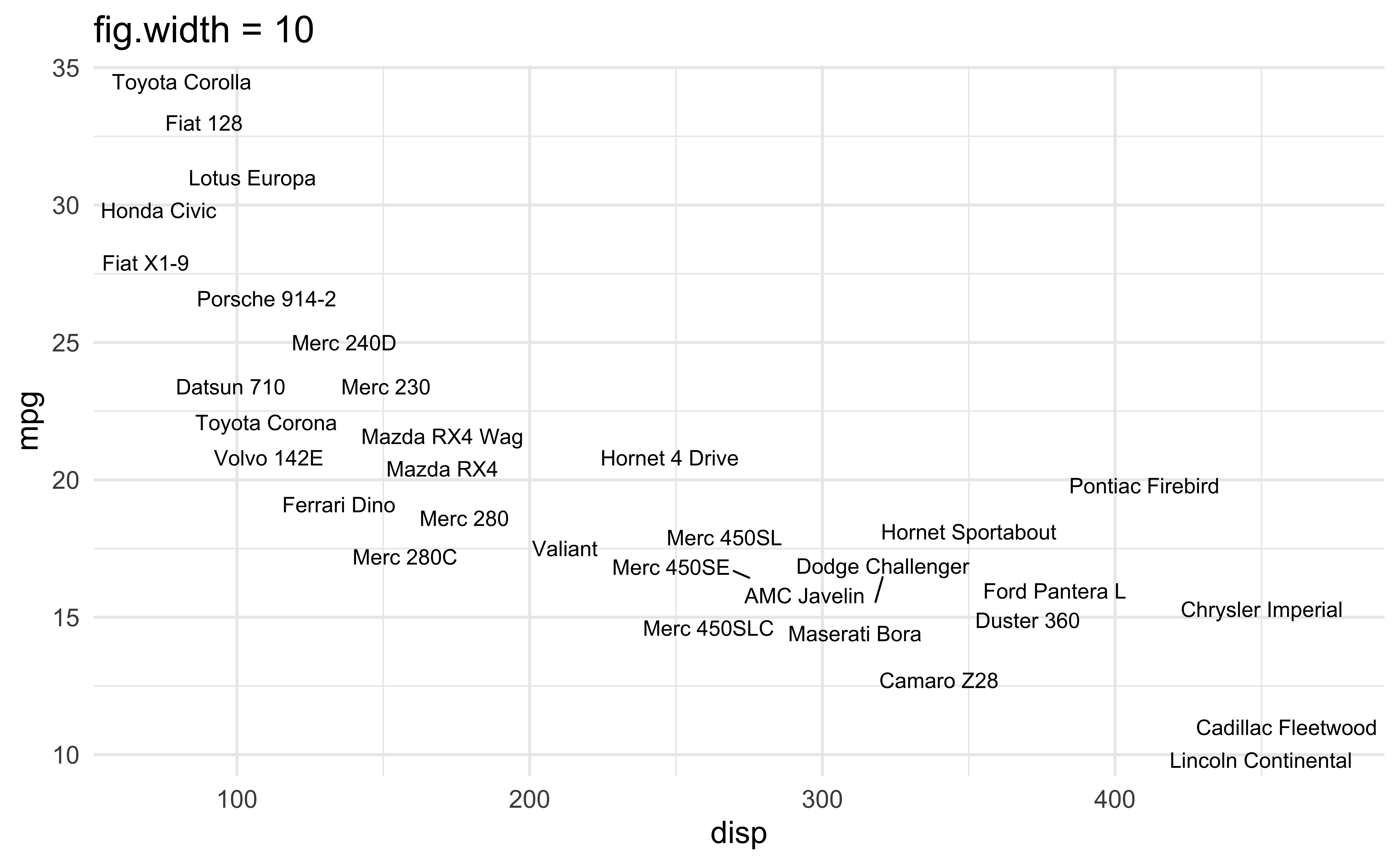
Multiple plots on a slide
First, ask yourself, must you include multiple plots on a slide? For example, is your narrative about comparing results from two plots?
If no, then don’t! Move the second plot to to the next slide!
If yes,
Insert columns using the Insert anything tool
Use
layout-ncolchunk optionUse the patchwork package
Possibly, use pivoting to reshape your data and then use facets
Columns
Insert > Slide Columns
Quarto will automatically resize your plots to fit side-by-side.

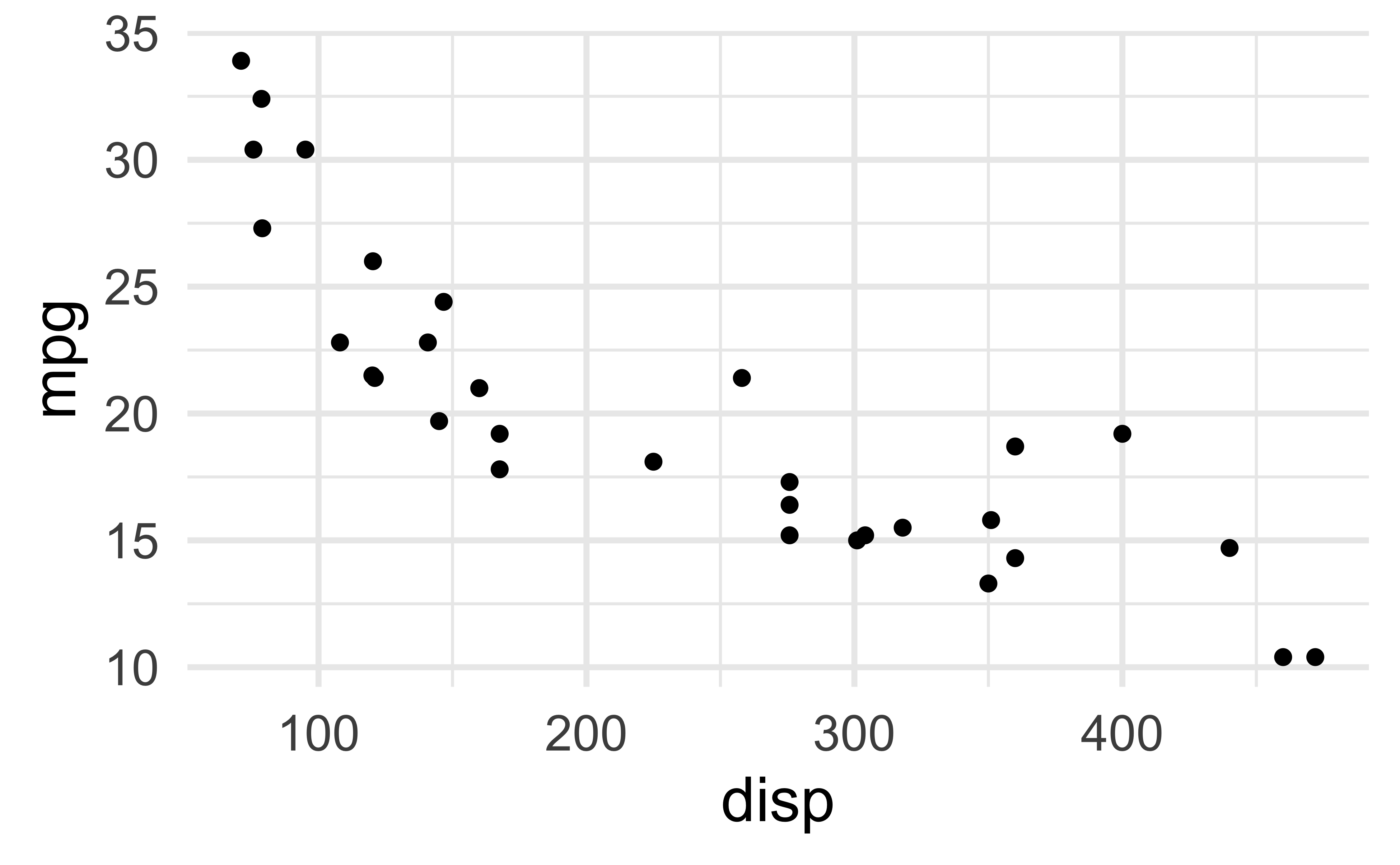
layout-ncol
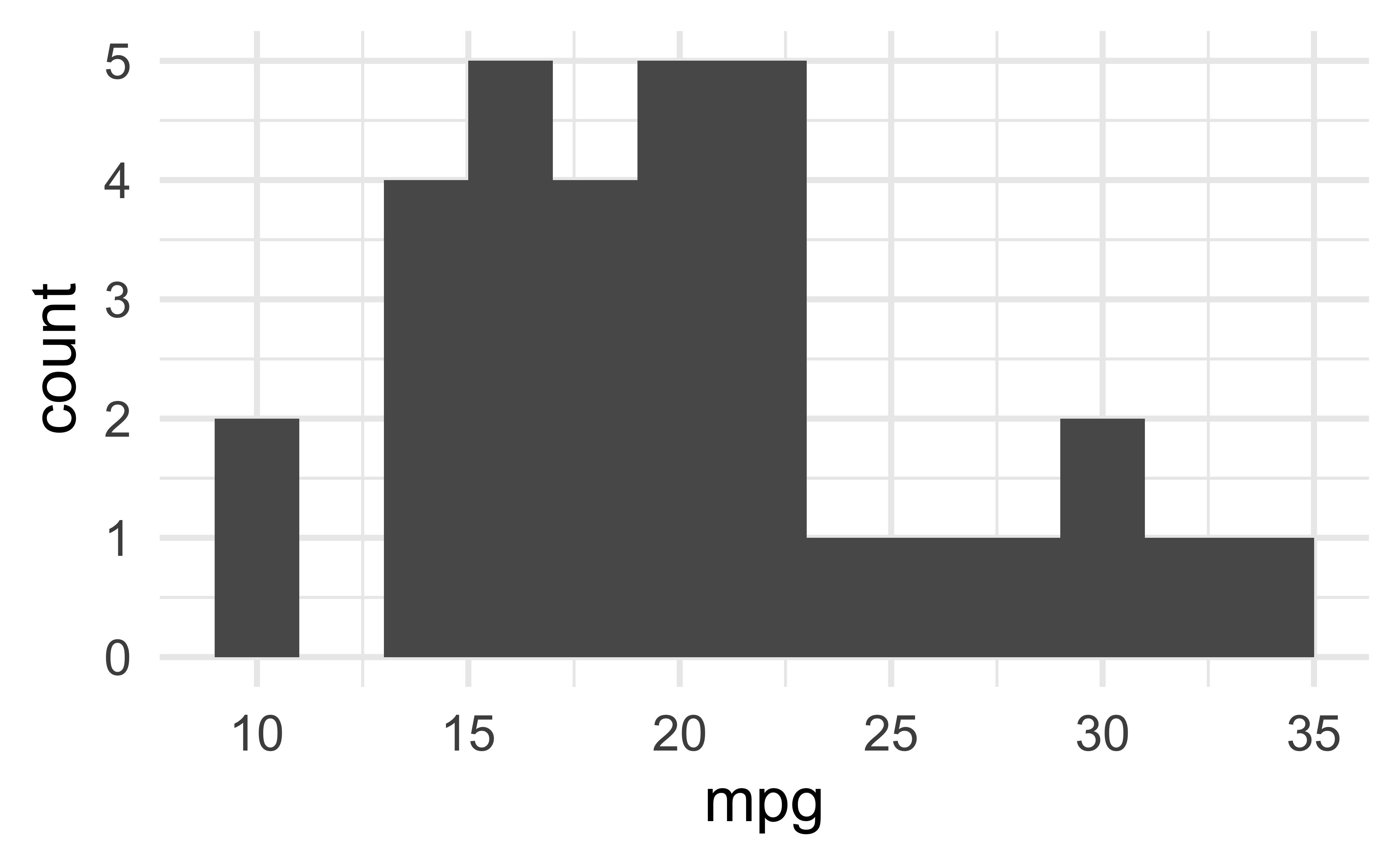

patchwork
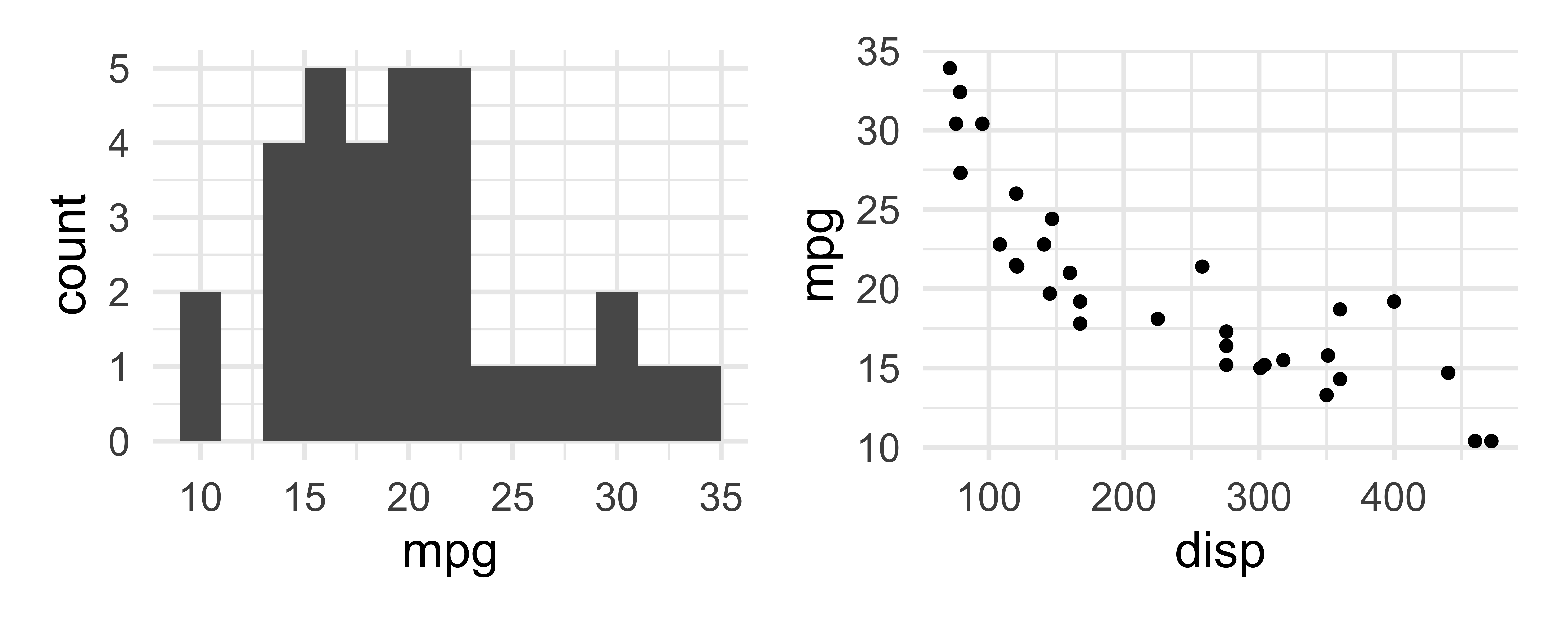
patchwork layout I
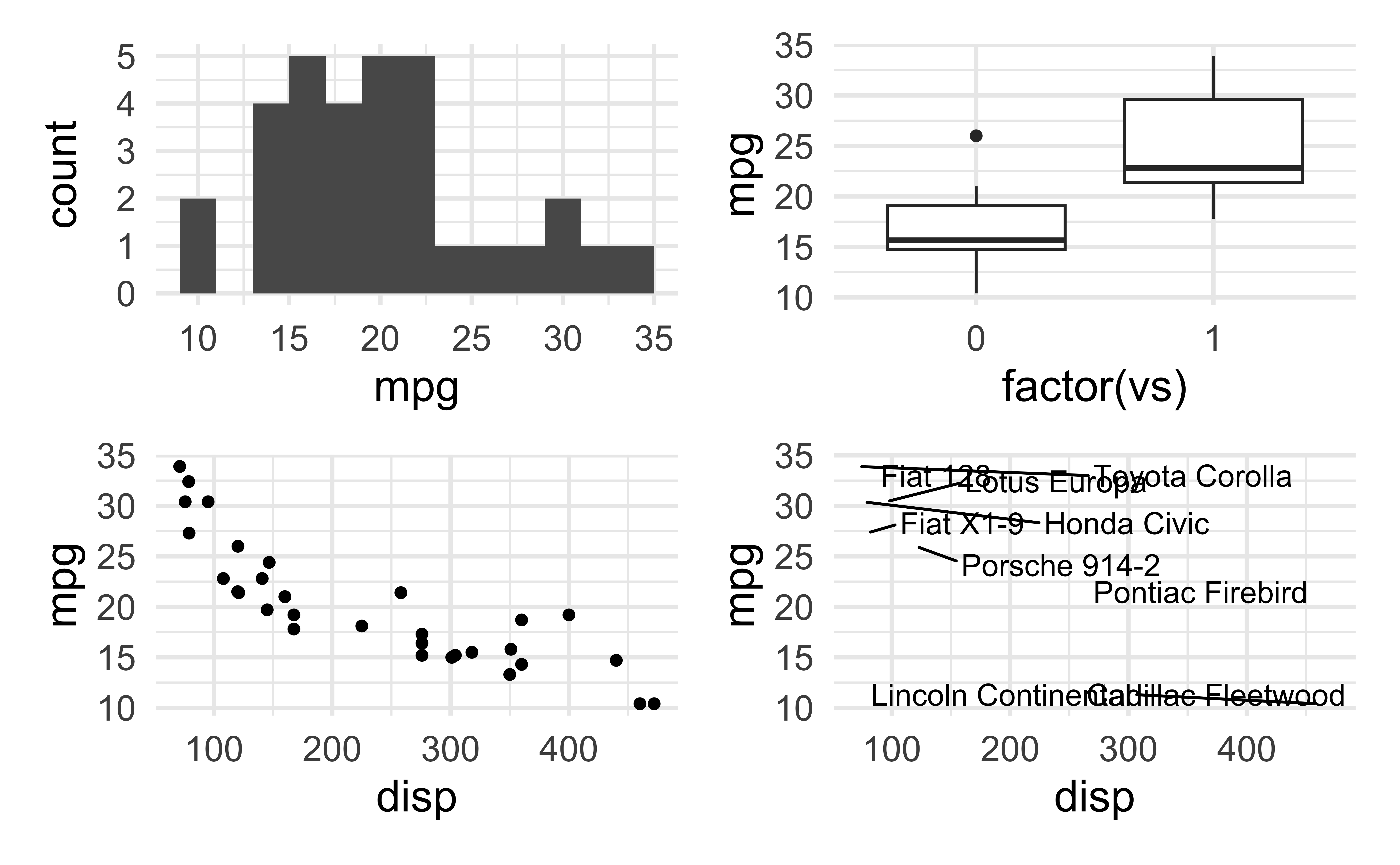
patchwork layout II
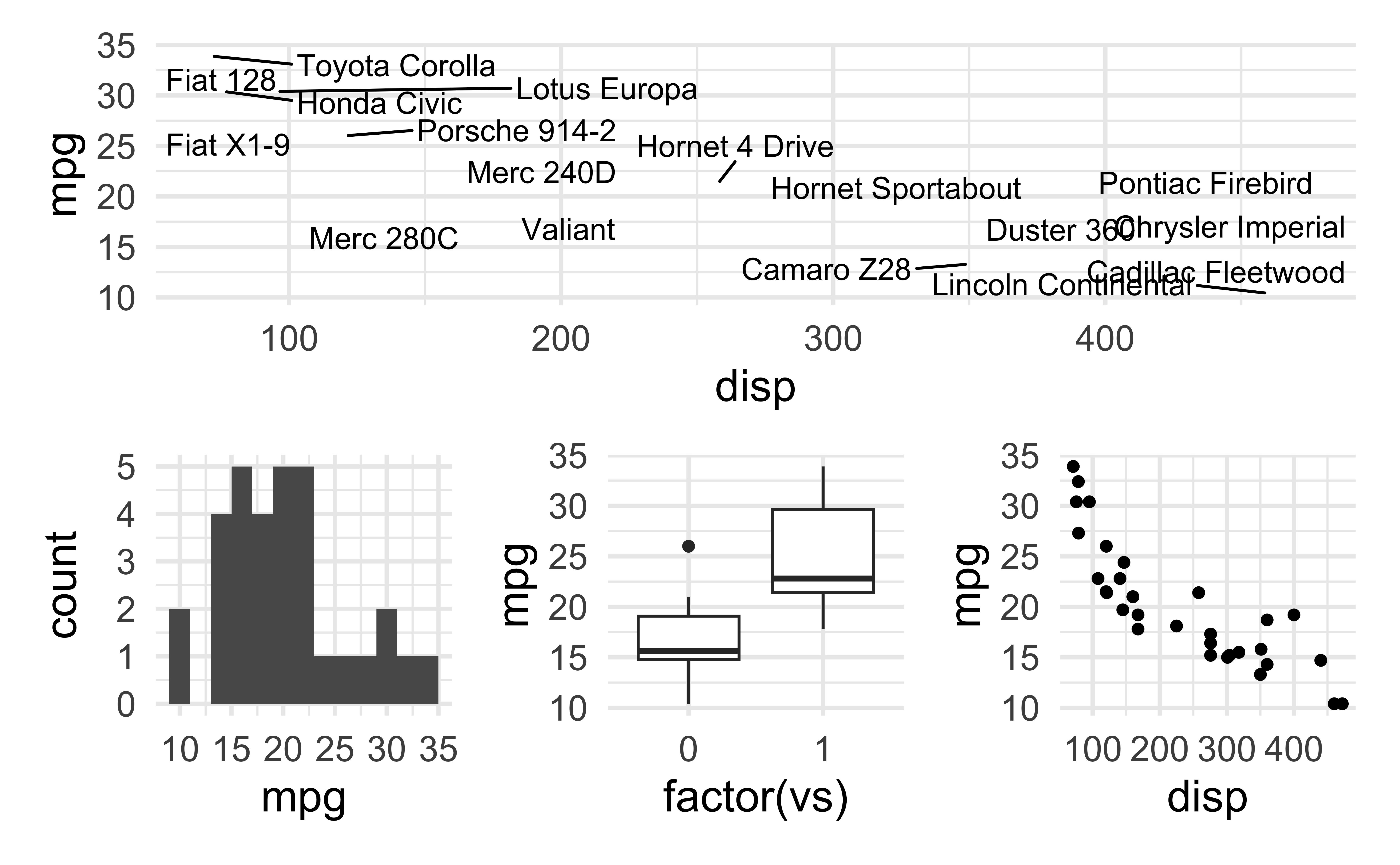
patchwork layout III
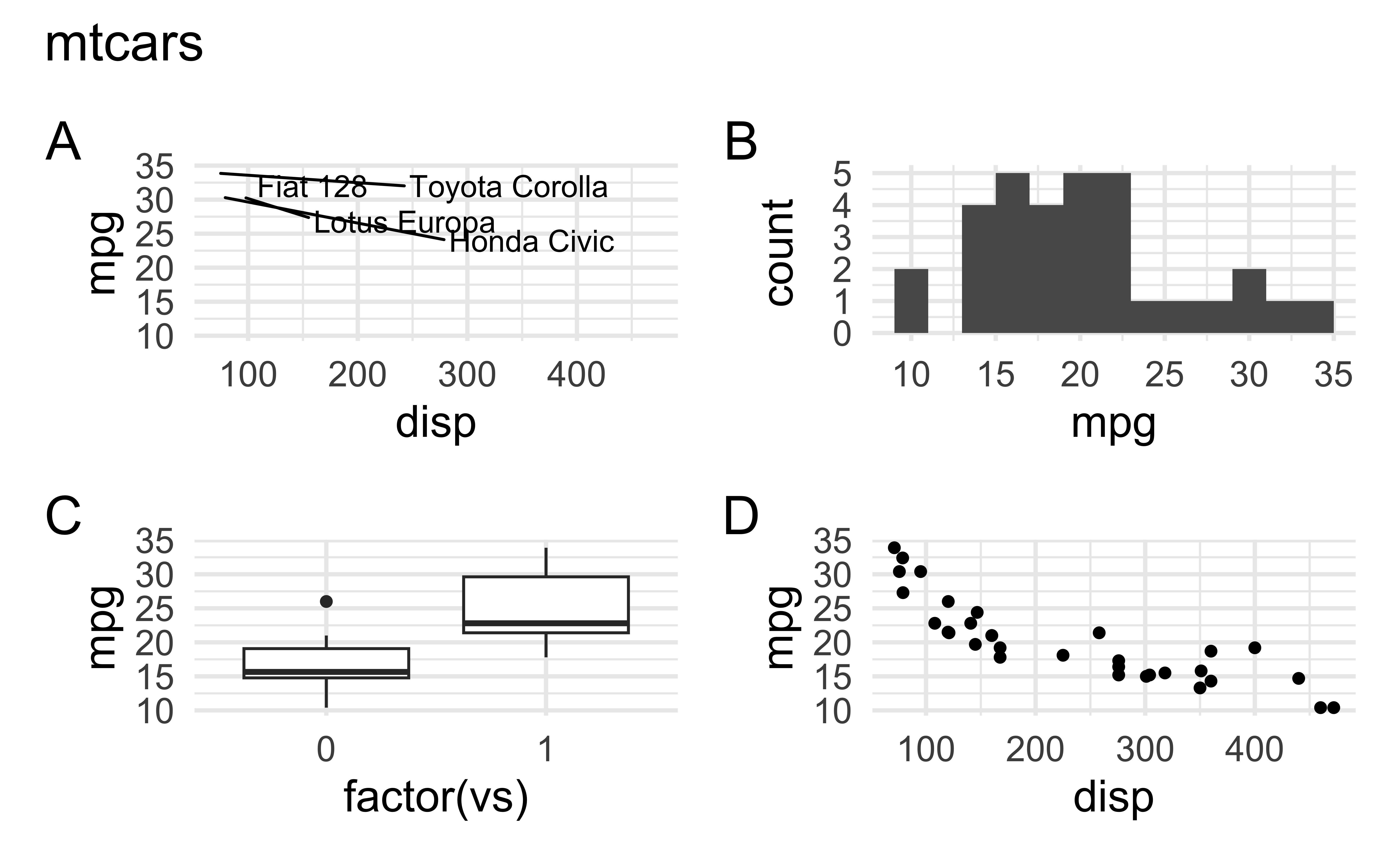
patchwork layout IV
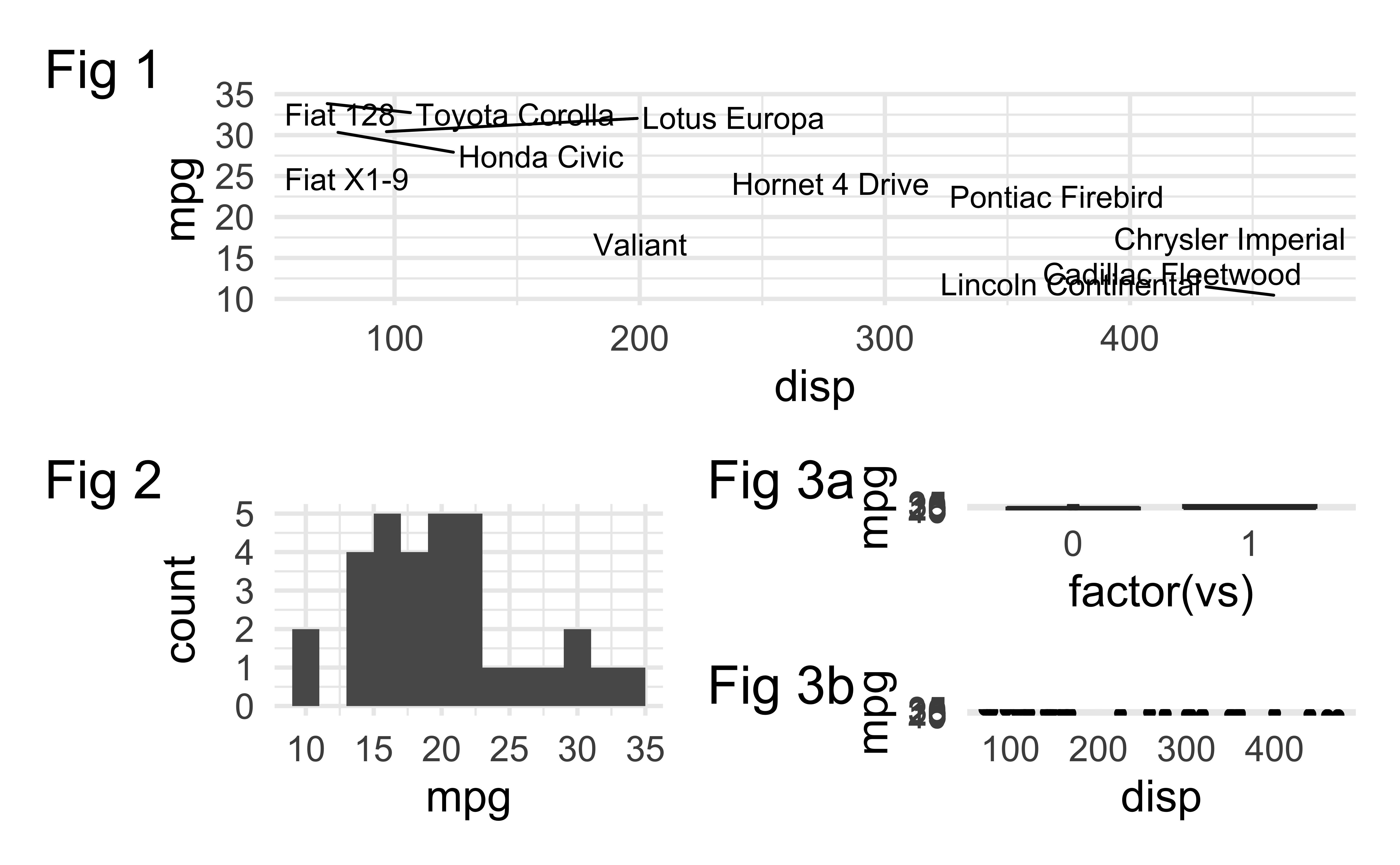
More patchwork
Learn more at https://patchwork.data-imaginist.com.
Want to replicate something you saw in my slides?
Look into the source code at https://github.com/INFO-526-SU24/INFO526-SU24/slides/.
