Visualizing time series data I
Lecture 6
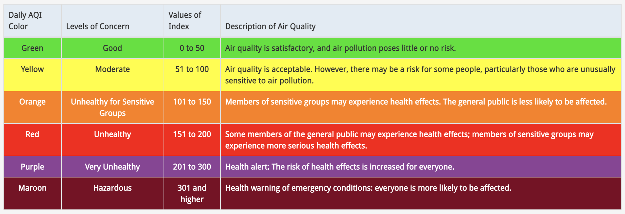
Air Quality Index
The AQI is the Environmental Protection Agency’s index for reporting air quality
Higher values of AQI indicate worse air quality
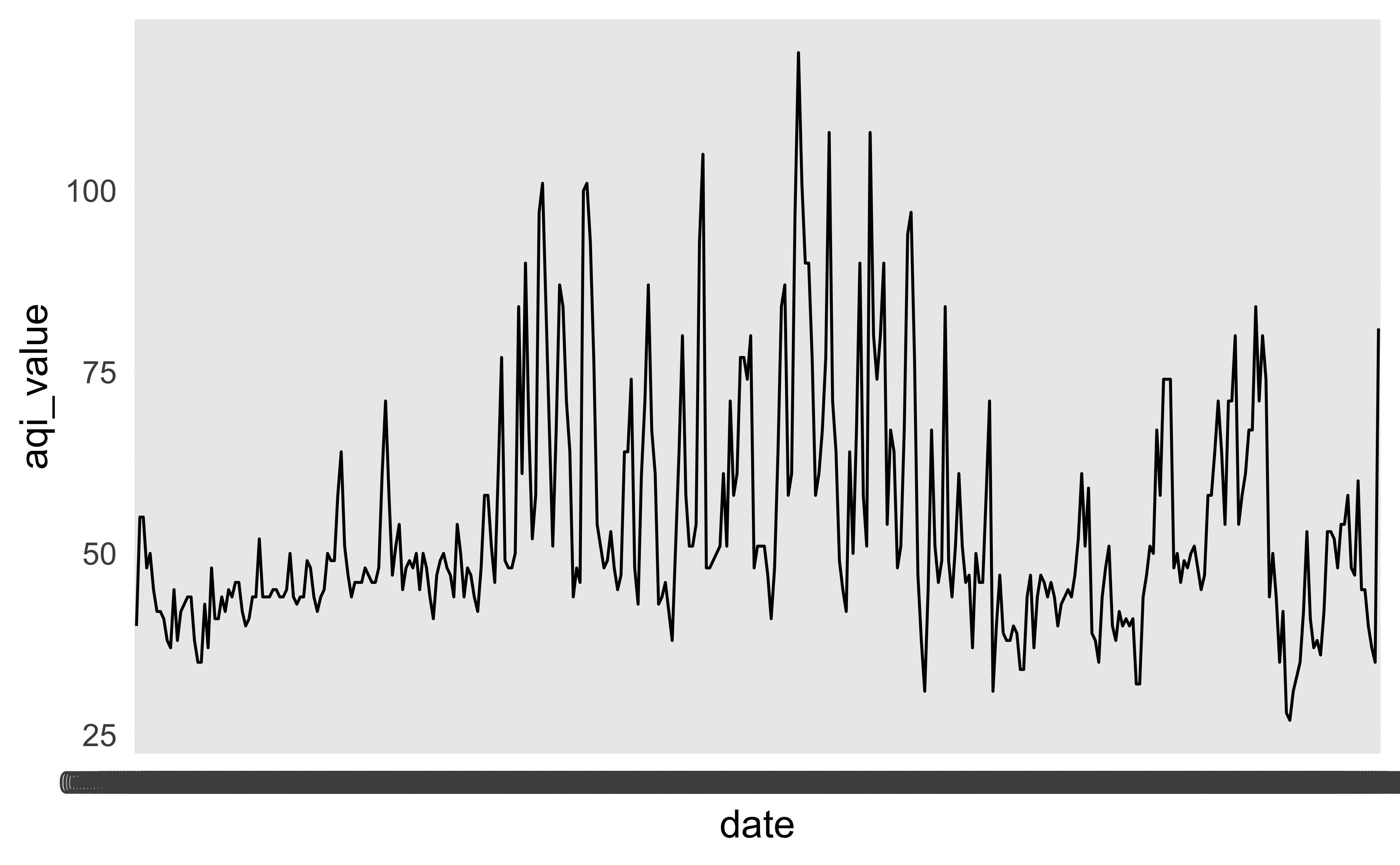
First look
This plot looks quite bizarre. What might be going on?
Another look
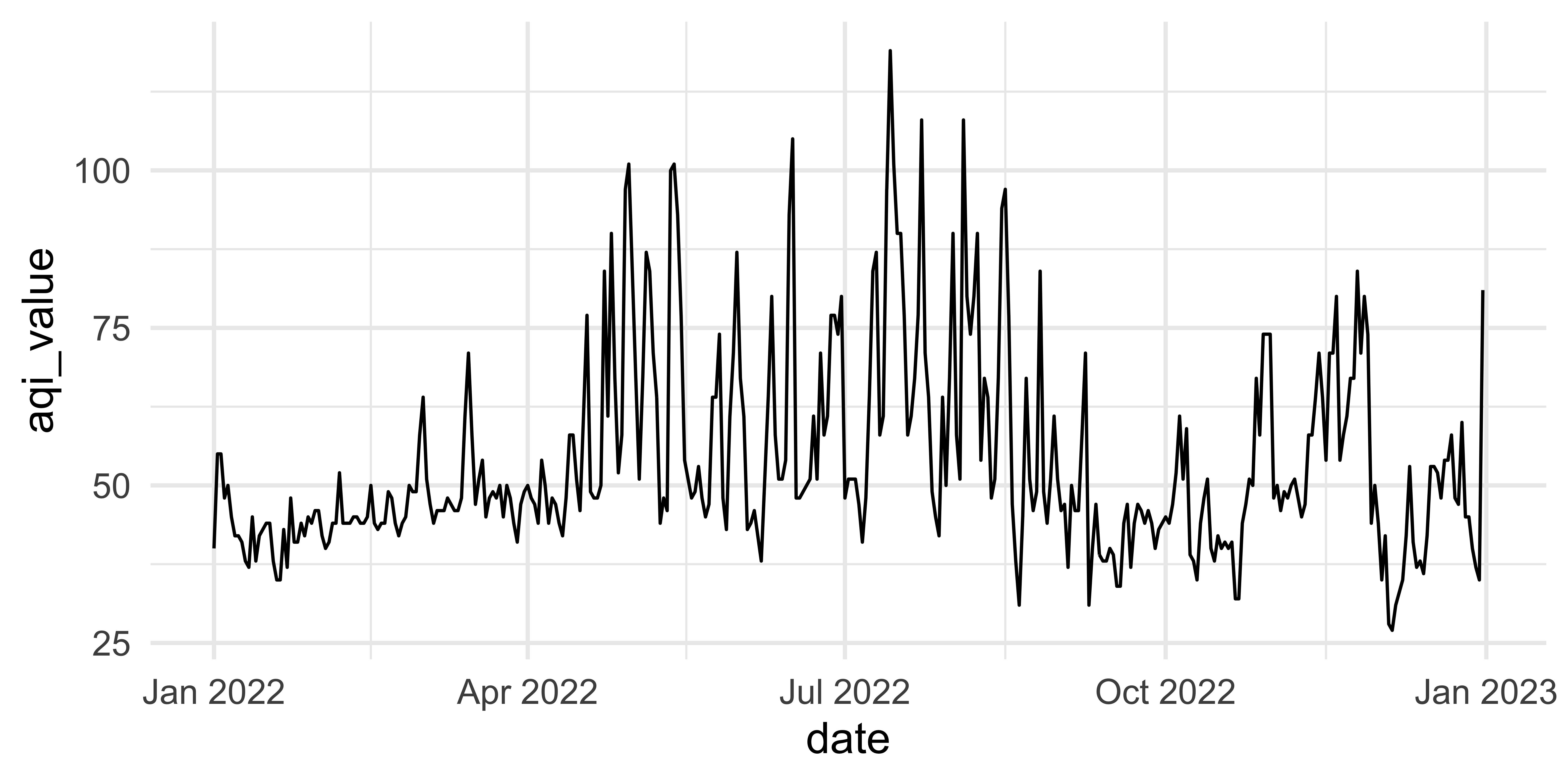
How would you improve this visualization?
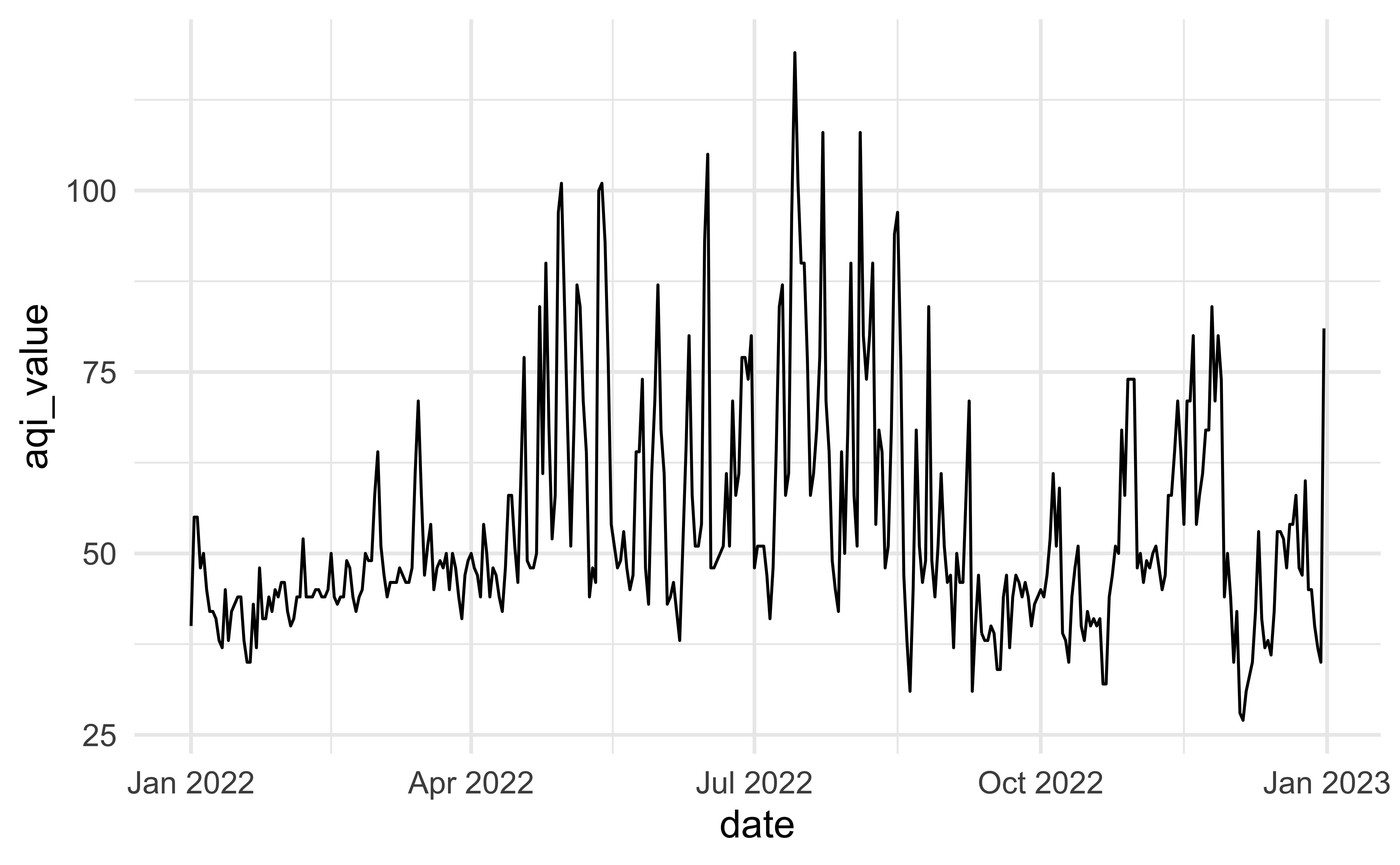
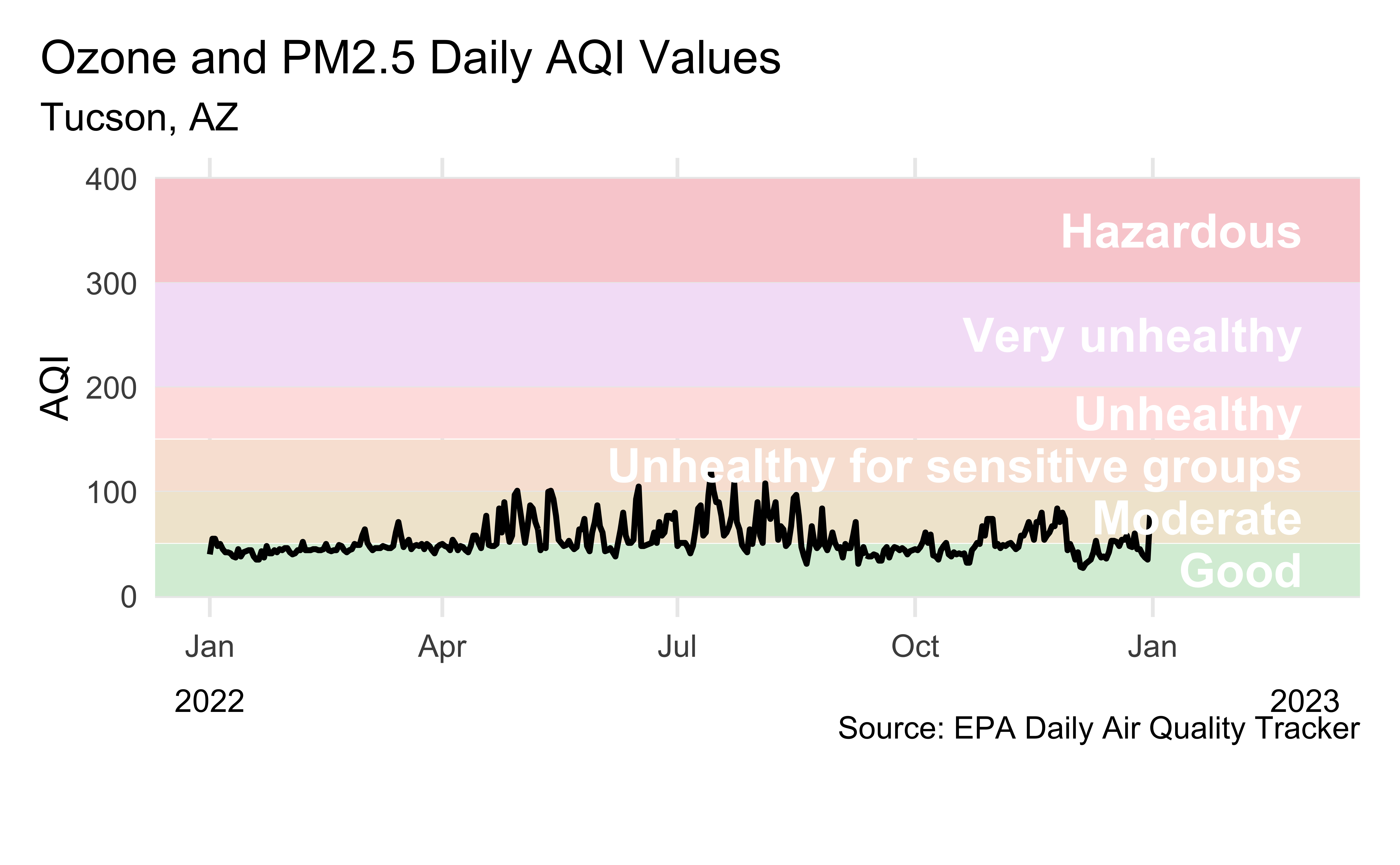
Visualizing Tucson AQI
Livecoding
Setup
aqi_levels <- tribble(
  ~aqi_min, ~aqi_max, ~color,    ~level,
  0,        50,       "#D8EEDA", "Good",
  51,       100,      "#F1E7D4", "Moderate",
  101,      150,      "#F8E4D8", "Unhealthy for sensitive groups",
  151,      200,      "#FEE2E1", "Unhealthy",
  201,      300,      "#F4E3F7", "Very unhealthy",
  301,      400,      "#F9D0D4", "Hazardous"
)
tuc_2022 <- read_csv("https://raw.githubusercontent.com/INFO-526-SU24/INFO-526-SU24/main/slides/06/data/tucson/ad_aqi_tracker_data-2022.csv",
na = c(".", ""))
tuc_2022 <- tuc_2022 |>
janitor::clean_names() |>
mutate(date = mdy(date))Reveal below for code developed during live coding session.
Code
aqi_levels <- aqi_levels |>
  mutate(aqi_mid = ((aqi_min + aqi_max) / 2))

tuc_2022 |>
  filter(!is.na(aqi_value)) |>
  ggplot(aes(x = date, y = aqi_value, group = 1)) +
  geom_rect(
    data = aqi_levels,
    aes(
      ymin = aqi_min, ymax = aqi_max,
      xmin = as.Date(-Inf), xmax = as.Date(Inf),
      fill = color, y = NULL, x = NULL
    )
  ) +
  geom_line(linewidth = 1) +
  scale_fill_identity() +
  scale_x_date(
    name = NULL, date_labels = "%b",
    limits = c(ymd("2022-01-01"), ymd("2023-03-01"))
  ) +
  geom_text(
    data = aqi_levels,
    aes(x = ymd("2023-02-28"), y = aqi_mid, label = level),
    hjust = 1, size = 6, fontface = "bold", color = "white"
  ) +
  annotate(
    geom = "text",
    x = c(ymd("2022-01-01"), ymd("2023-03-01")), y = -100,
    label = c("2022", "2023"), size = 4
  ) +
  coord_cartesian(clip = "off", ylim = c(0, 400)) +
  labs(
    x = NULL, y = "AQI",
    title = "Ozone and PM2.5 Daily AQI Values",
    subtitle = "Tucson, AZ",
    caption = "\nSource: EPA Daily Air Quality Tracker"
  ) +
  theme(
    plot.title.position = "plot",
    panel.grid.minor.y = element_blank(),
    panel.grid.minor.x = element_blank(),
    plot.margin = unit(c(1, 1, 3, 1), "lines")
)![]()